My Role:
UX/UI Designer
Duration
June 2017- July 2017
Tools
Sketch and Invision
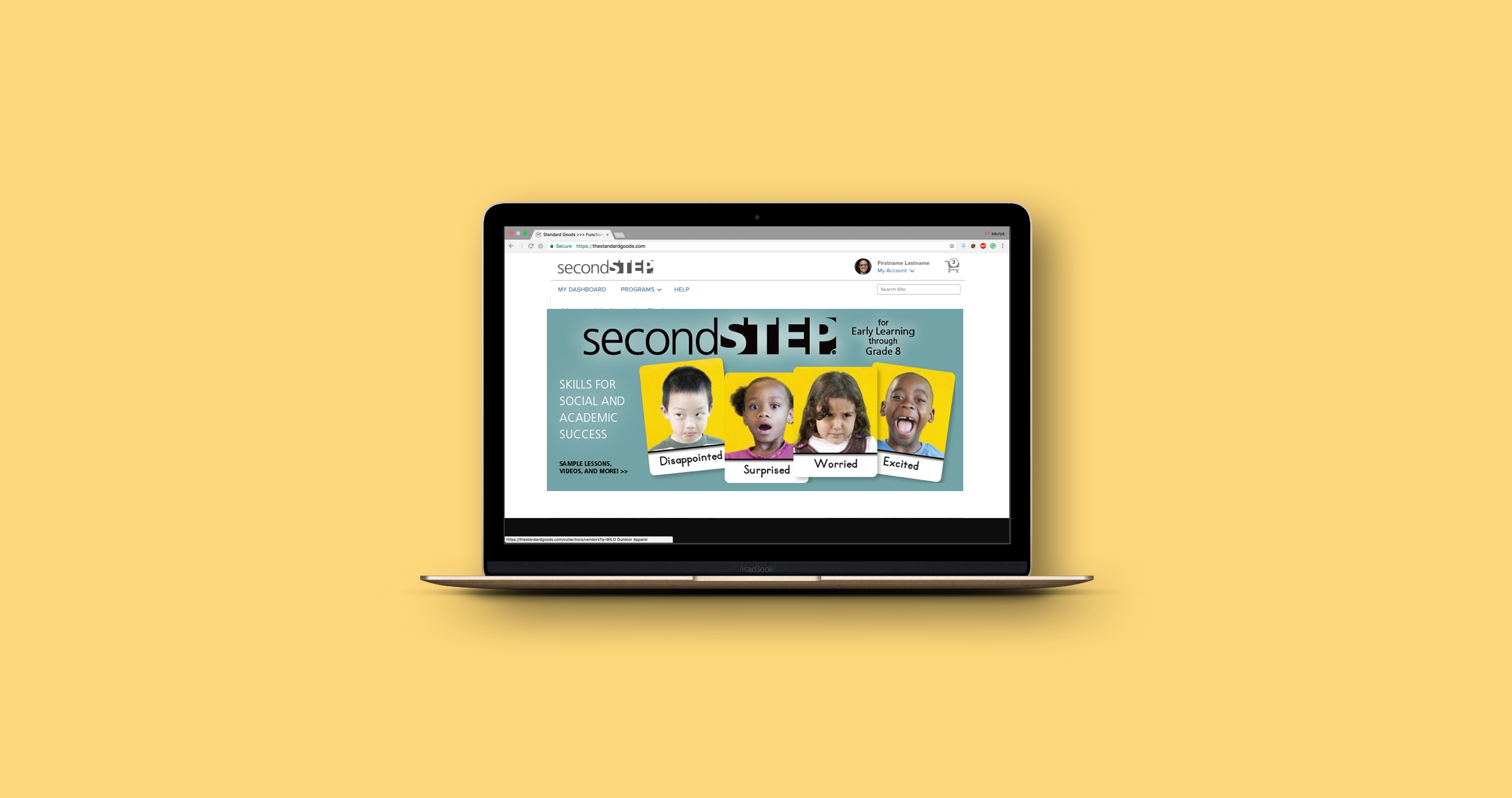
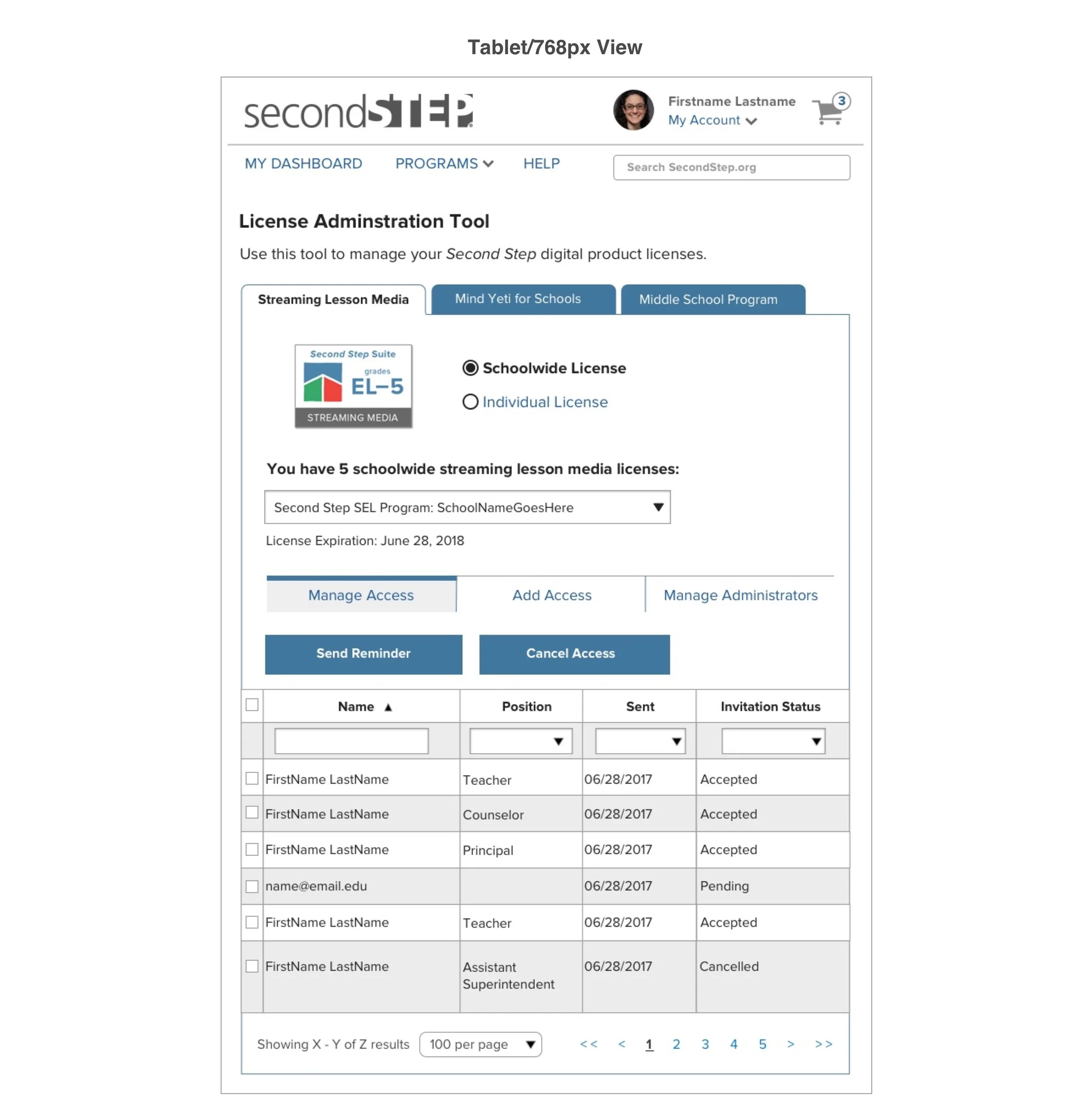
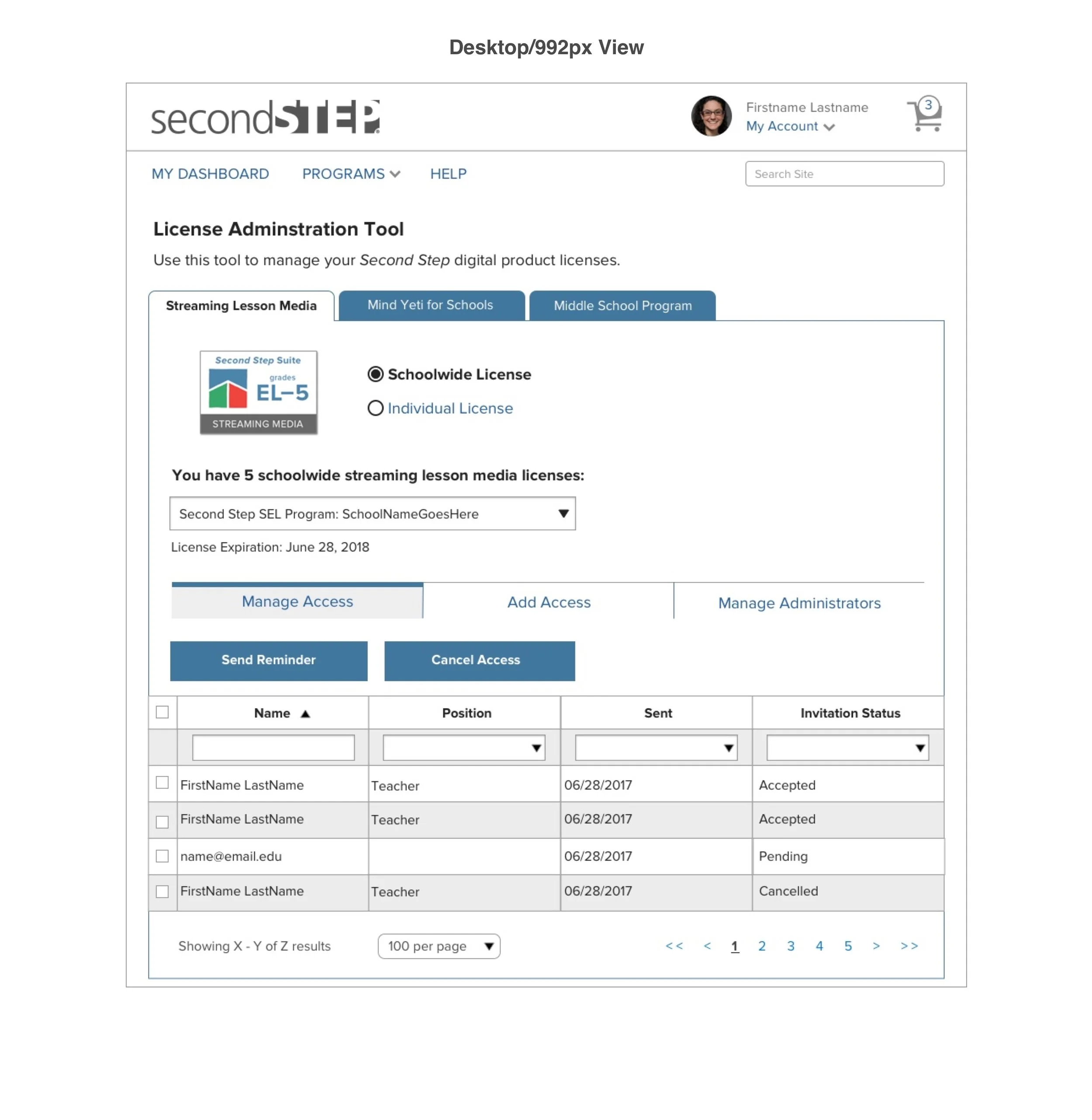
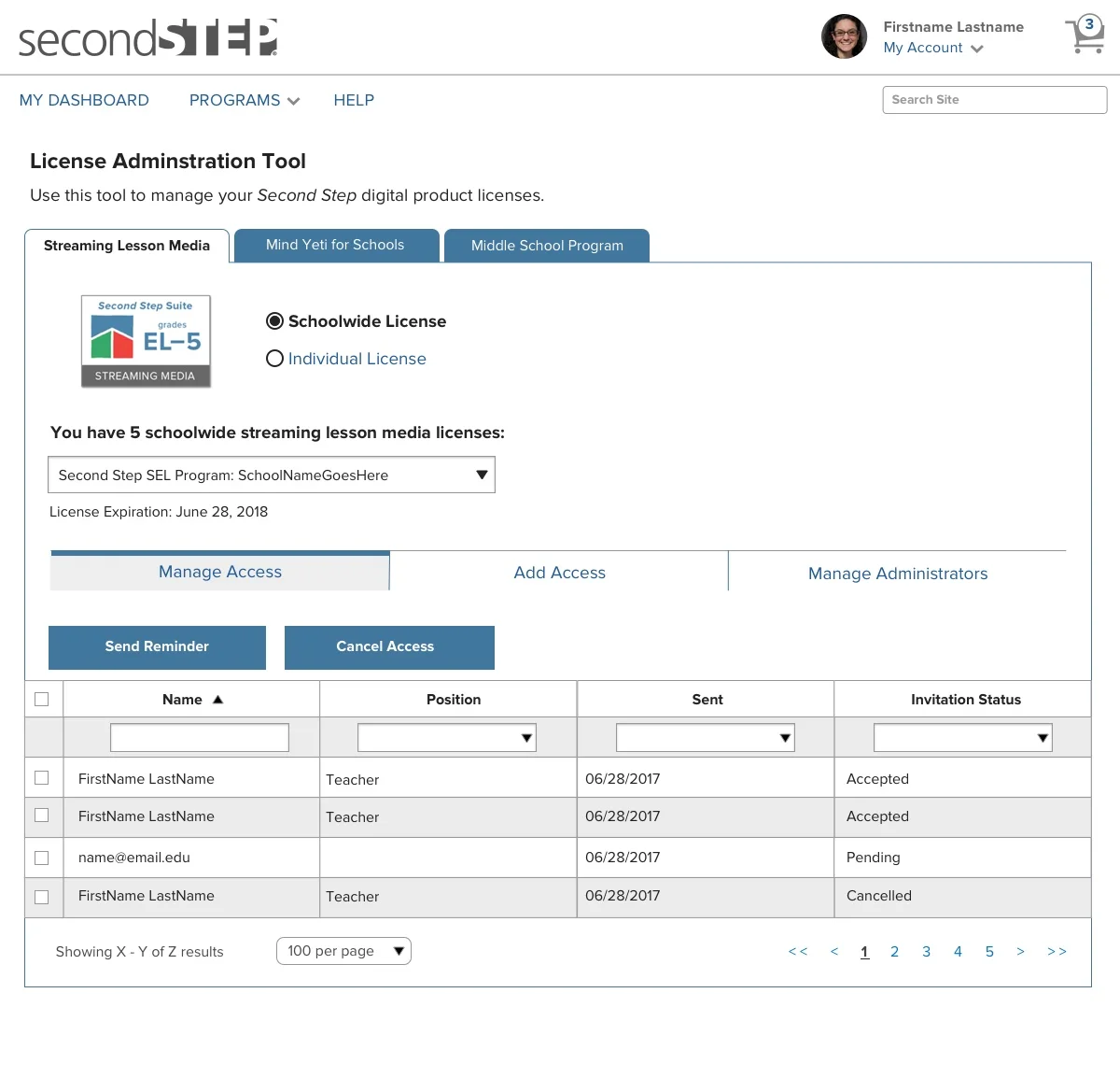
Re-design the license page for digital lesson
Committee for Children provides social-emotional learning programs that helps children learn the skills they need to thrive in school and in society. Second step suite is one of the program that committee for children offers to the school as digital lesson materials. They provide license for streaming lesson media(SLM) products for individual classroom as well as school-wide. I worked as a contract UX designer to re-design the license page for buying a digital lesson. The project was launched back in 2017.
Premium class
Background
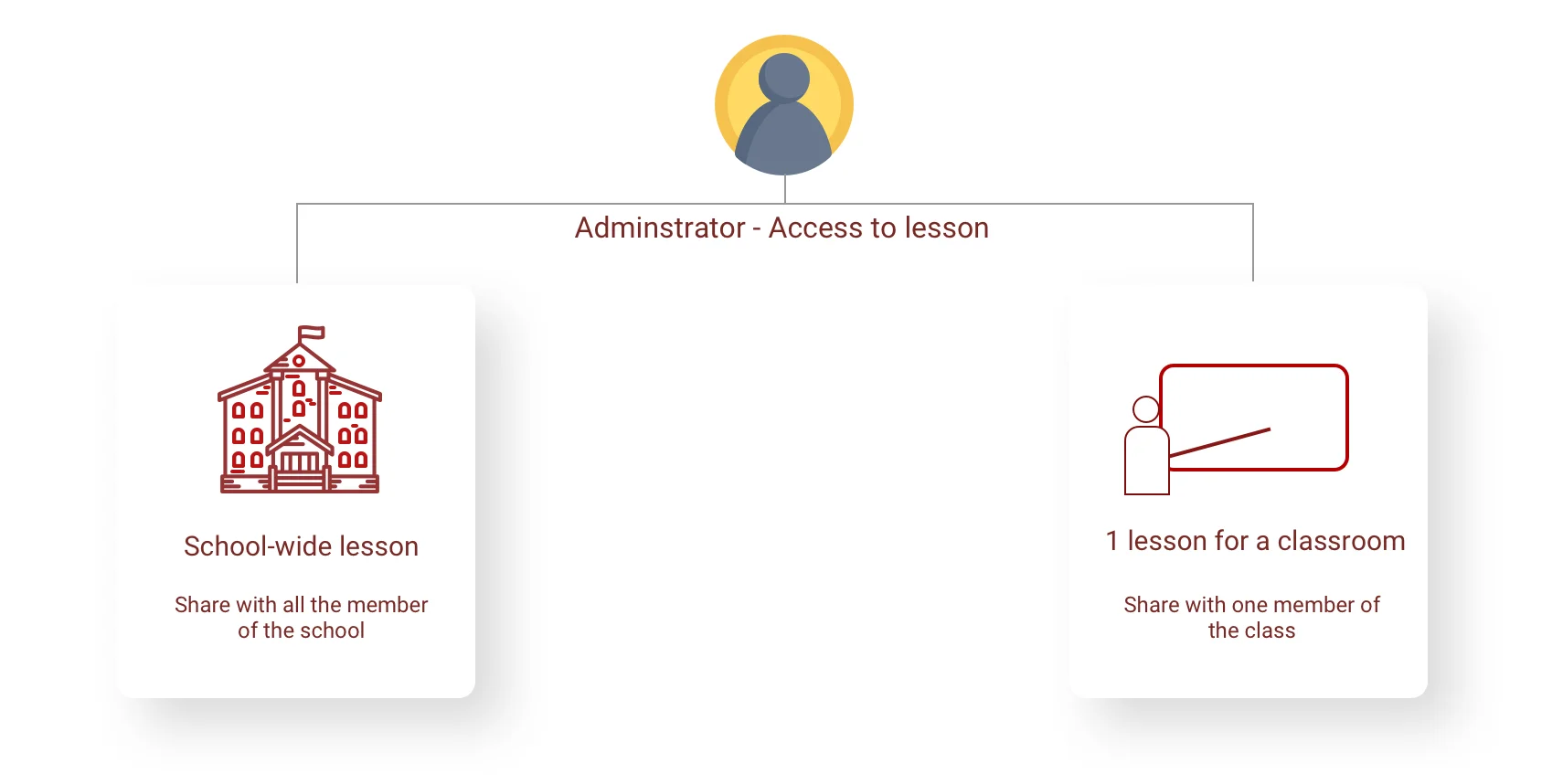
I met with the design team to learn the background of the current license page.
A school admin can get a license for lessons in two ways.
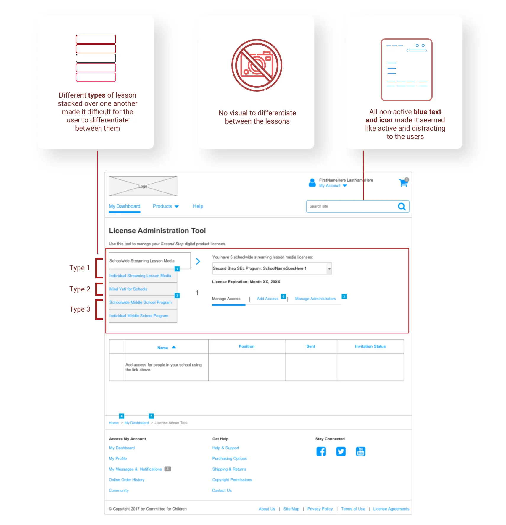
Current Usability Misses
I identified 3 main usability misses in the current license page design.
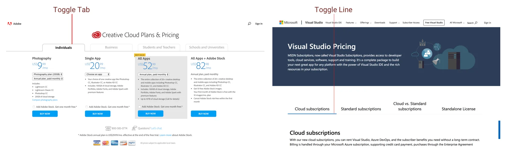
Competitive analysis on feature design
I did competitive analysis to understand how purchasing plan for buying a license is currently being addressed at different platforms. I found out that these platform have tab switch between products to distinguish from one another.
Design
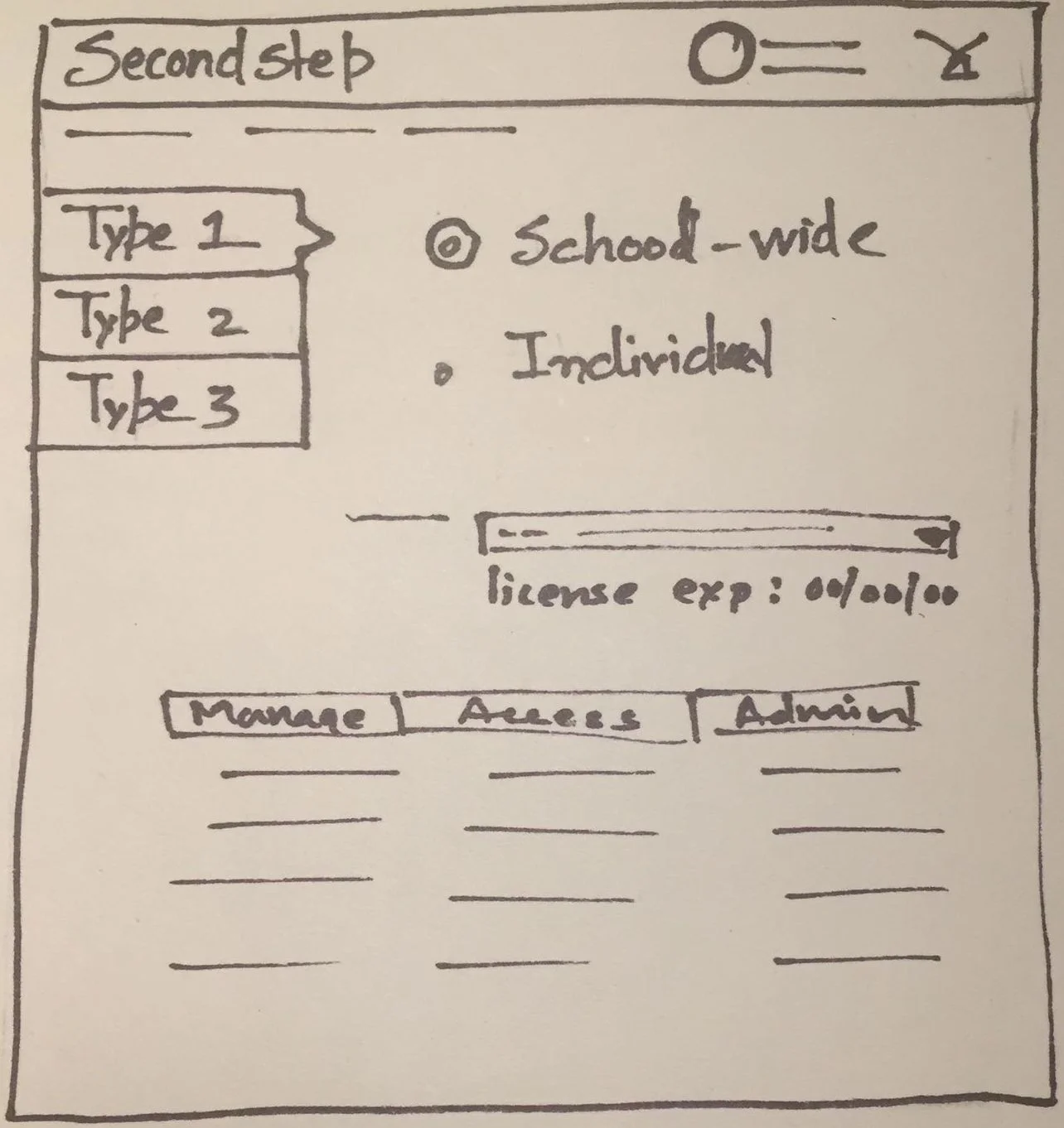
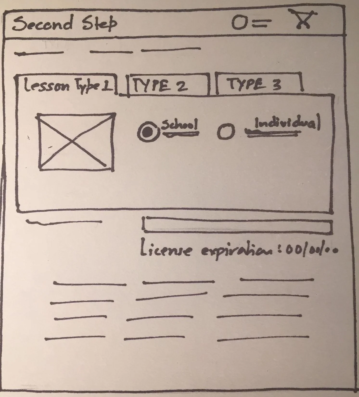
I designed two option for the tabs on paper and based on the feedback from design team, I chose the 2nd one to moved forward.
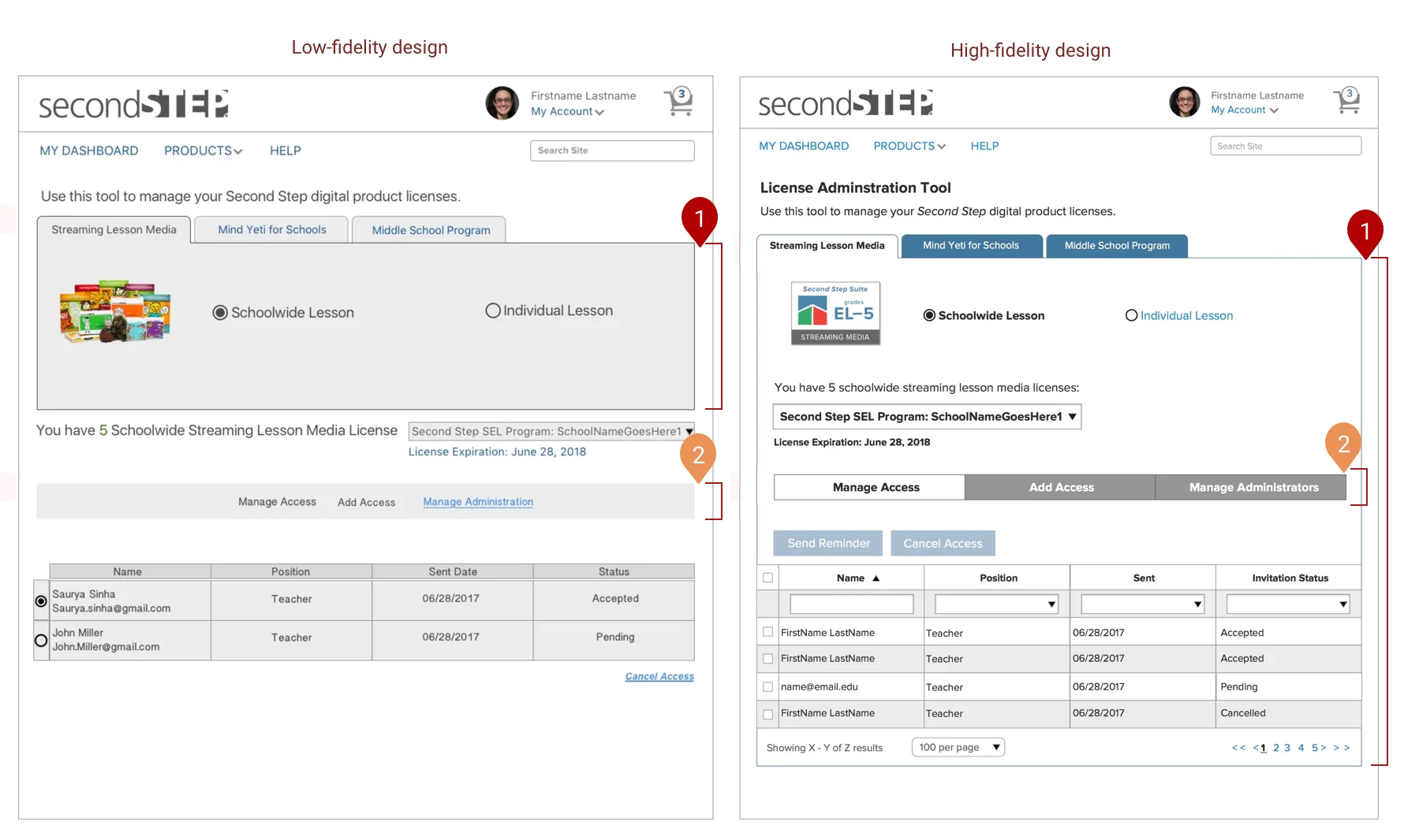
Low to high fidelity Prototype(1st Iteration)
I shared the low-fidelity prototype design with the stakeholders and got a positive feedback to continue the design to high-fidelity prototype as the team had a better experience since they can switch easily between different lesson, instead of getting confused between the lessons stacked on one another.
I made the below changes based on the first feedback.
Extended the tab layout to the end of the page so that every interaction on the page stays within the box.
Created tab design to manage access bar so they are more distinguishable
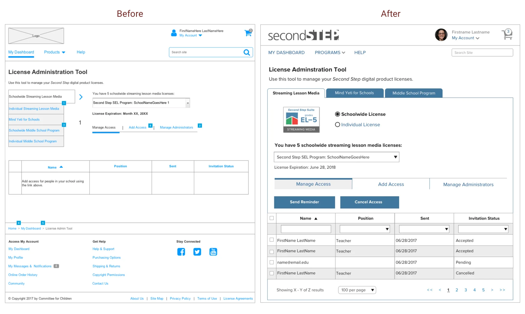
Final Iteration
I performed usability testing on the 2nd iteration and made the below changes.
Aligning the switch tabs to the left side resulted in better user experience and now user could focus their eye on one side of the page.
Adding blue line on top of selected tab in the manage access tab bar clearly highlighted the selection.
Before and After
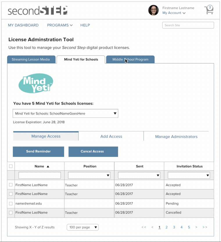
A school admin switching between all the 3 lessons
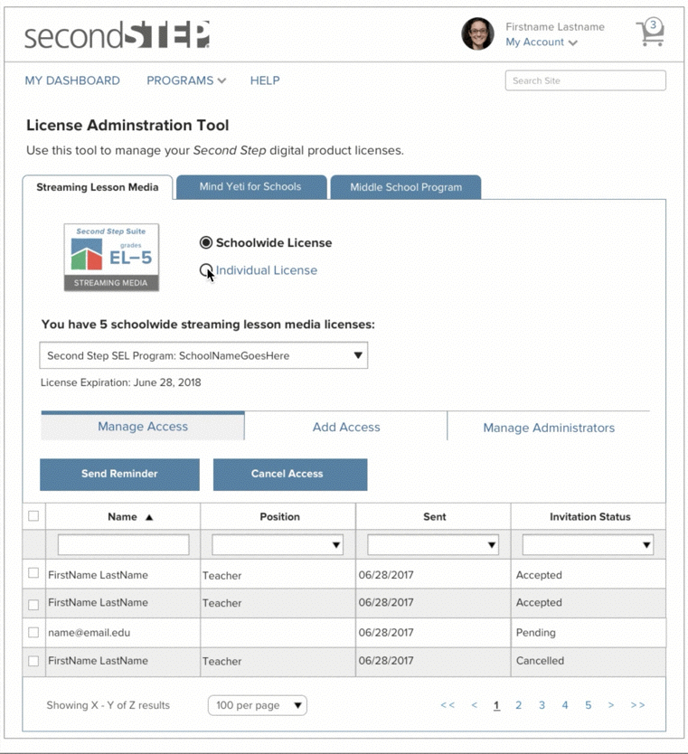
A school admin accessing school-wide and individual license
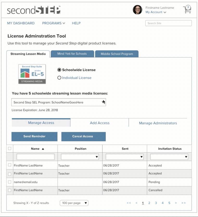
An admin can share the license with school teachers or any authorized person in the list.
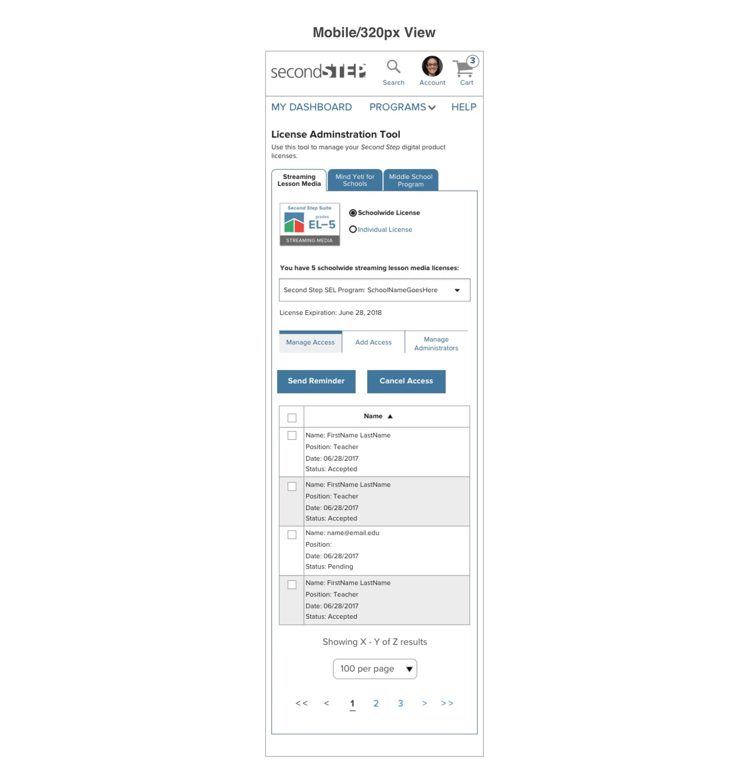
Responsive design for Multiple devices - Mobile, Tablet, and Desktop
Next Steps
The project was launched back in 2017. I don’t have information on the success rate of the project as it was a contract role. The design can only be accessed by a school admin who is part of second step suite.
Other Projects
OfferUp - UX Design Intern
VUI - Customer Journey Map

Smartsheet- UX Designer

Pickup Order - VUI Design
Autonomous Cabs- UX Designer

Pratt Fine Arts - Visual Designer