
Collaboration Toolbar
Smartsheet is a software-as-a-service application for project management. It is used to share content and communicate within a team for easy collaboration.
Goals
The goal of the project was to improve user experience of the collaboration toolbar and the modal window which is located at the bottom of the sheet.
Target Users
Professionals who use project management tools
My Role
Stakeholder interview, Product analysis, User interview, Competitive analysis, Affinity diagram, Wireframes, Mockups, Prototype, Usability testing
Team
Anna Steadham - UX researcher
Saurya Sinha(Me) - UX designer
Duration
Feb - March 2017 (4 weeks)
Current Design

Current toolbar and modal window
Final Design
Stakeholder Interview
To begin the design process, my team and I conducted an interview with Smartsheet UX team to learn about the current problems in toolbar as well as any design constraints we would be working with.
They mentioned that the company is currently getting lots of calls from their users who are unable to find existing functionality within the product. So they are exploring better ways for users to interact with sharing and collaboration functions in the application.
Design constraints:
Logo and left side formatting toolbar cannot be modified for this particular redesign
Redesign must be flexible to allow more content to be added in these sections later
User Interview
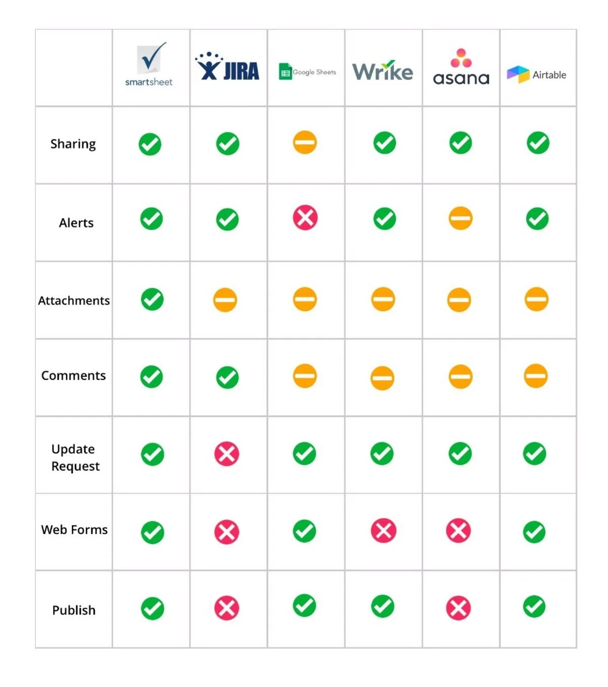
We interviewed 17 people in-person who frequently use other project management tool like Jira, Asana, Airtable and Google Sheet and performed a user testing with them on the current design of the toolbar.
Feedback
The feedback we received during in person interviews were:
Poor toolbar placement
Current toolbar looked disconnected from the rest of the page.
Confusing icon design and their names
Few of the tool name and icon design were confusing and often did not meet user's expectation.
Improper use of modal window
Modal windows, that appeared on clicking at the icon, covered half of the screen content and made it difficult for the user to interact with the sheet.
Poor notification readability
Number notifications beside icon name were not noticeable by the users.

Competitive Analysis
We did competitive analysis between Smartsheet's top 5 competitor which also provide similar collaboration features.
Placement of Competitor’s Toolbar
Asana

Asana's collaboration toolbar is located at top of the task sheet
Google sheet

Google Sheet's collaboration toolbar is located at the top right side of the sheet
Jira

Jira's collaboration toolbar is located at the top left of the sheet
In our analysis, we found that all the competitor's collaboration features were often located at the top of the sheet, which guaranteed visibility of the tool.
Affinity Diagram
We made word-cloud of common features present across competing applications, their placements and icon designs. The following features were inspiration for our design:
Red dot to show new notification
No label for the icons

Current toolbar for reference
Design
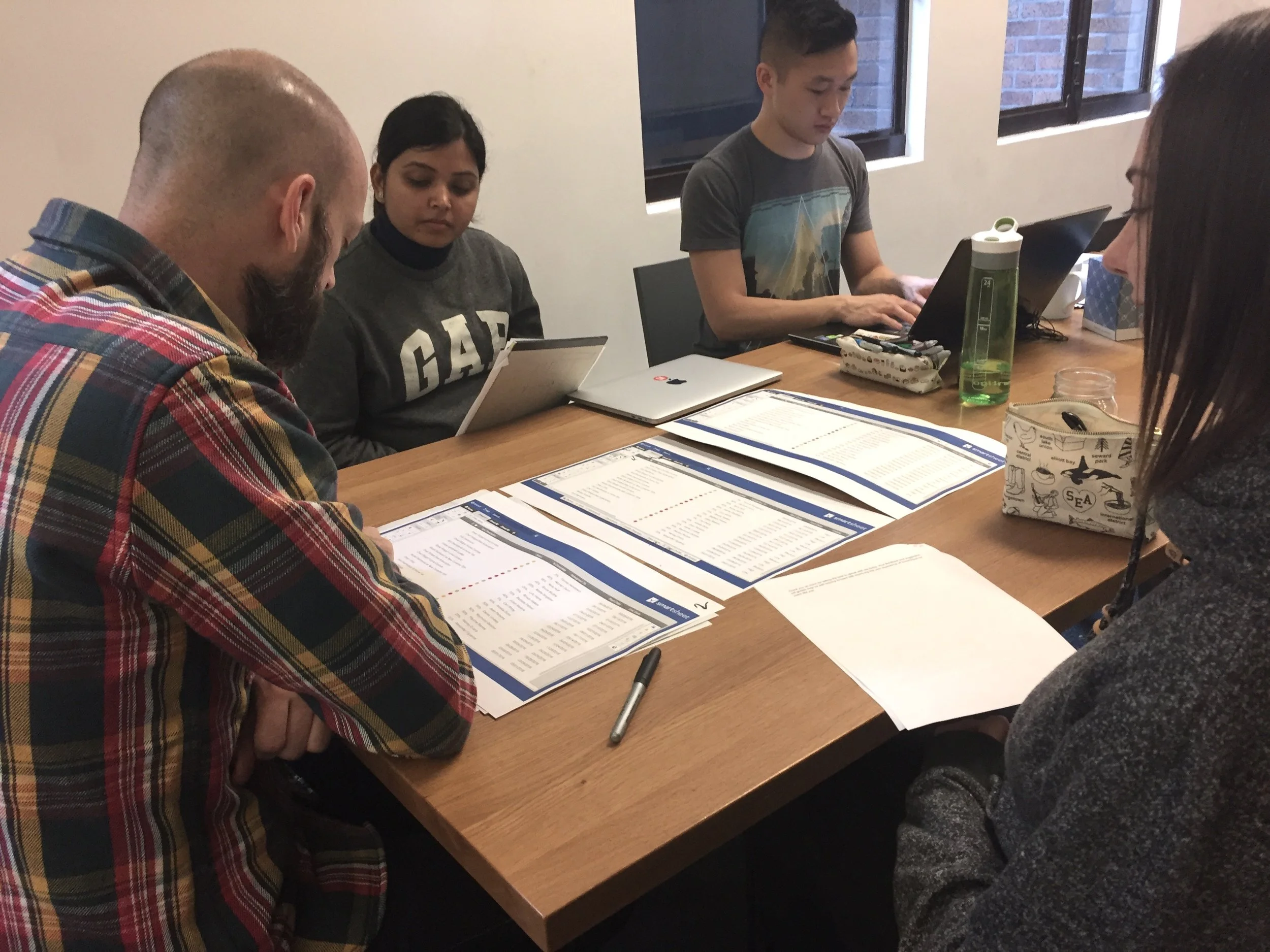
After gathering information from user feedback and research, we started brainstorming our initial ideas on paper. I quickly turned our sketches into wireframes in Sketch app.


Redesigned toolbar with red dot notification. We removed icon names from the toolbar and highlight them on hover, making it consistent with other UI elements in Smartsheet app.
Alternative Design Choices
I designed three different options for placement of the toolbar and two sizes for the non-modal window and then performed usability testing on these designs.


Two options for non-modal window
Usability Testing
We created a set of questions for each design that we went through while doing the user testing with 6-8 users. During the tests we wanted to verify our assumptions and better understand:
What is the best placement for the collaboration toolbar?
How should the new tool windows interact with the user?
We iterated on the design based on findings from our testing. You can find the set of questions and discussion guide here.
Final Solution
Findings from User Testing
Users preferred toolbar to be on the top left, especially if they were tools that they would be using often. Their eyes were more focused on the top, left, and center of the screen.
They appreciated redesigns that made use of “dead space".
They also mentioned that the content in bigger non-modal is well spaced out and easy to read.
Iterations
Spacing between toolbar: Gap between the new toolbar and the existing left side toolbar by aligning the new toolbar with the shaded column of cells in the spreadsheet.
Non-modal background: Removed grey border from the version B and moved towards flat UI design for final version of the non-modal window

Final Design with Annotations
Next Steps
I suggested the following items as next step:
More research to be done around icon design and names on the toolbar using card sorting method.
Making the content of non-modal more user friendly and concise.
Utilizing the freed-up space at the bottom of the sheet by extending the working space.
Other Projects

OfferUP - UX Design Intern

Uber Aid - UX Designer

Autonomous Cabs- UX Designer

Pratt Fine Arts - Visual Designer

Pickup order - VUI Design