Company
OfferUp
Duration
June, 2019 - Sep, 2019
Type
UX Design Internship
UX Design Internship
In the past summer, I was a UX Design intern on Sellers Team at OfferUp. I worked on multiple projects during my 3 month internship. Due to NDA I am unable to share the details of my major project. In the sections below, I have documented the other project. Feel free to reach out anytime!
I worked on following projects:
◼︎Re-designing the Sell Faster feature: 🖋️ The goal was to redesign and test the new proposed concept for the Sell Faster feature for professional sellers without compromising its usability for individual sellers. I created wireframes, mockups, and hi-fidelity prototypes. I performed usability testing with current users on OfferUp and iterated over my design by incorporating feedback received during testing. Since, I can share my work only for this project, I will elaborate about it in the sections below.
◼︎Researched and Designed a new feature for OfferUp platform:🕵 I gathered insights through market research and constructed a target persona based on data collected in 1:1 interviews. I worked with another UX designer, researcher and project manager to create information architecture. I created user-flows and mockups for a desktop experience and iterated over the design based on feedback received during user testing. This project is under NDA, so I am unable to present more details on this project.
◼︎Designed the component library for OfferUp app: 🤹 I designed the component library for the whole redesign of OfferUp’s iOS and Android application which is scheduled to launch in Q2 2020. I made sure that the design library grants both visual and functional consistency, helping the designers and developers navigate their way to complete the desired interaction during the product design and development.
For all the above projects, I worked under the mentor-ship of Nick Myette, Senior UX Designer at OfferUP.
Design Challenge
To redesign the Sell Faster feature for the existing platform and add bulk-action to the listing page.
The idea is to design for web version first and port it to the OfferUp mobile application later.
Target Users
Individual and professional sellers
Research
Stakeholder Interview
I conducted an interview with Product Manager and UX Researcher to learn about the current problems with Bulk-Promotion and Sell Faster feature.
They mentioned that the increase in the number of buyers has led to an increase in the number of professional sellers on OfferUp platform. As OfferUp is designed for individual sellers and these professional sellers are having hard time promoting different products in one go.
Individual sellers usually add limited items in limited quantities however professional sellers enlist multiple items in larger quantities.
Hence, with more and more professional sellers on-boarding the platform, there was a need to redesign the feature for professional sellers.
PR/FAQ
PR/FAQ is a Press Release (PR)/Frequently Asked Questions (FAQ) which is a customer-centric document for designing new products with possible solution..
I read the PR/FAQ to understand the problem of sellers with the existing Sell Faster feature and the new solutions that were proposed by the product development team.
Existing Problems
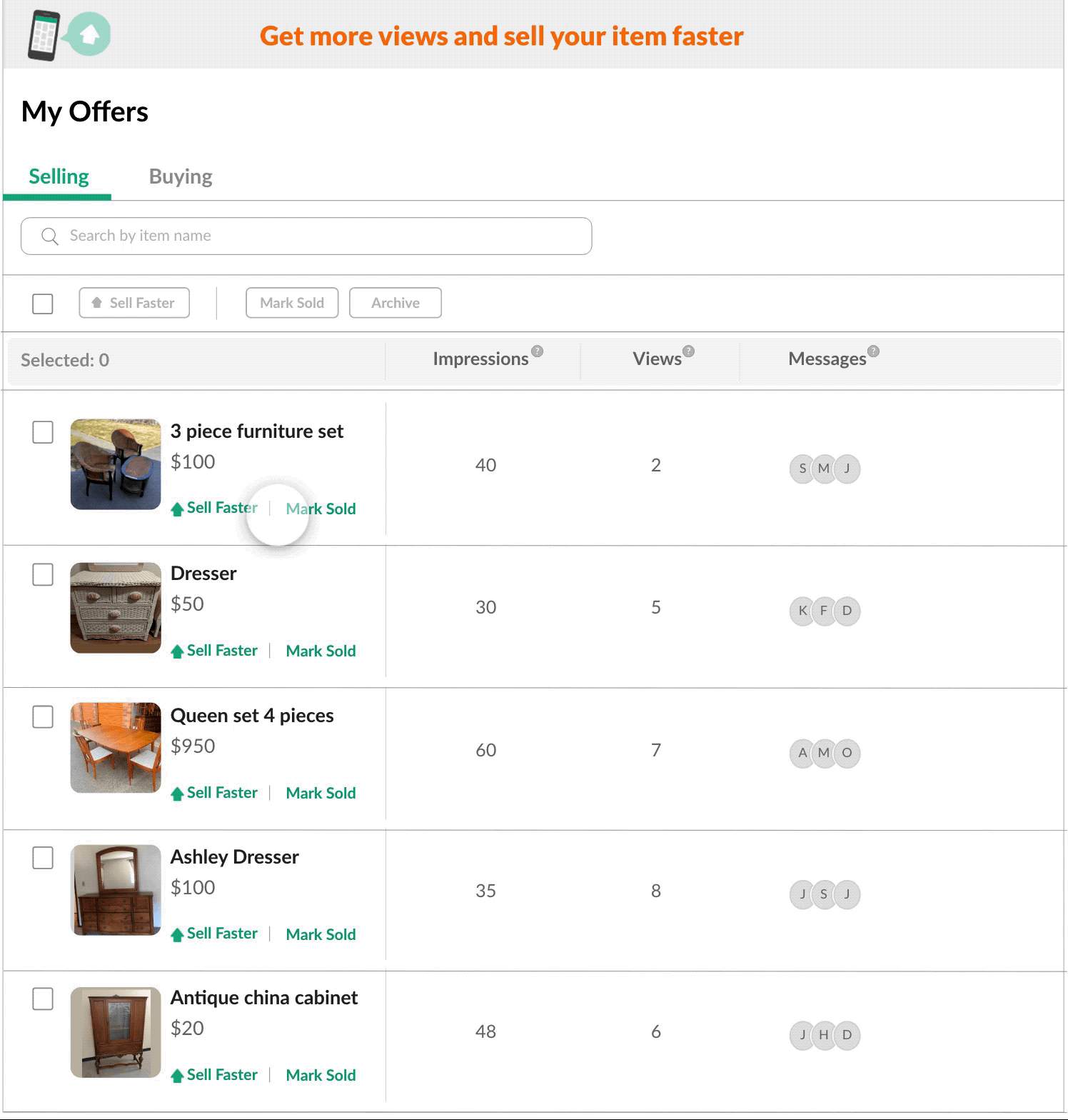
1. No option for bulk promotions on listing page: Sellers don’t have option to promote multiple products at the same time. They can only promote one product at a time. In order to promote an individual product seller should click on Sell Faster link.
2. Impressions and Views : During the earlier usability testing, the team found that users were skeptical about the term “views” on the product image. They were confused, if views means “the number of clicks on a product” or “the number of impressions the product has received so far”. So, we wanted to clarify and highlight the difference between views and impressions.
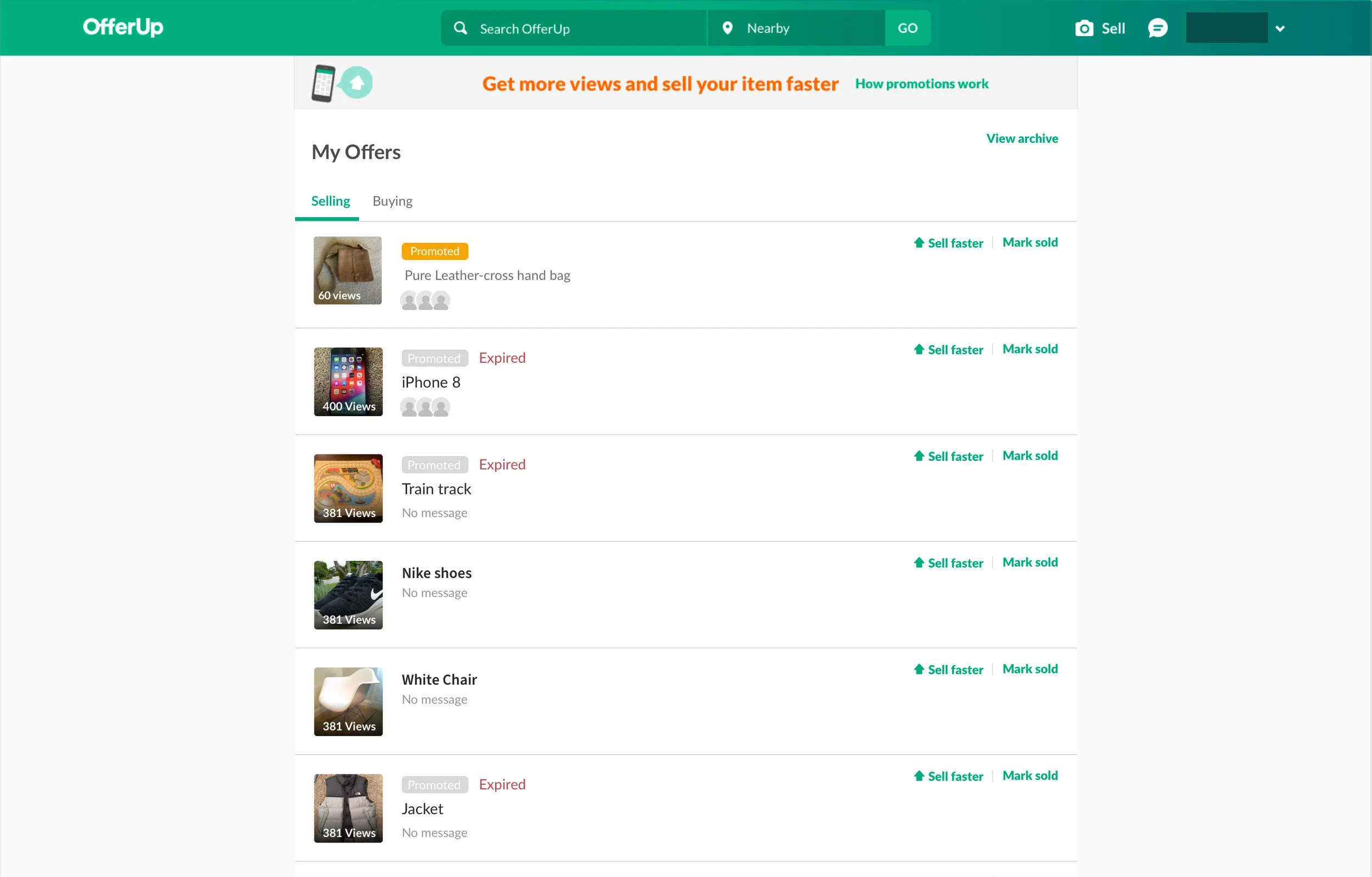
Listing page on OfferUp website
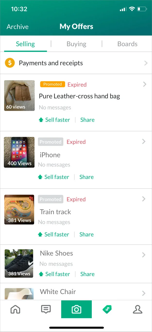
Listing page on OfferUp app
3. Value loss for customers: Currently, the cheapest option to promote(Sell faster) an item on OfferUp is $2.99 for 1 day, $7.99 for 3 days and $19.99 for a month. If an item sells before the promotion is over, the seller loses the remaining value.
4. No guarantee on number of views: The current Sell Faster feature mentions that it will give 14x more views to the promoted product, but it is not very transparent in the total number of views generated.
I did not add the example of promotion page for the website version here because the website version is not updated with the latest promotion options.
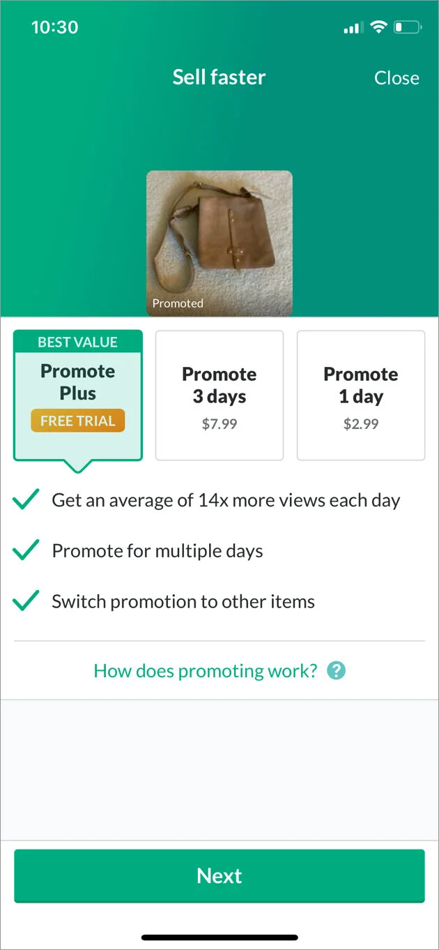
Three options to promote an item
Proposed solution
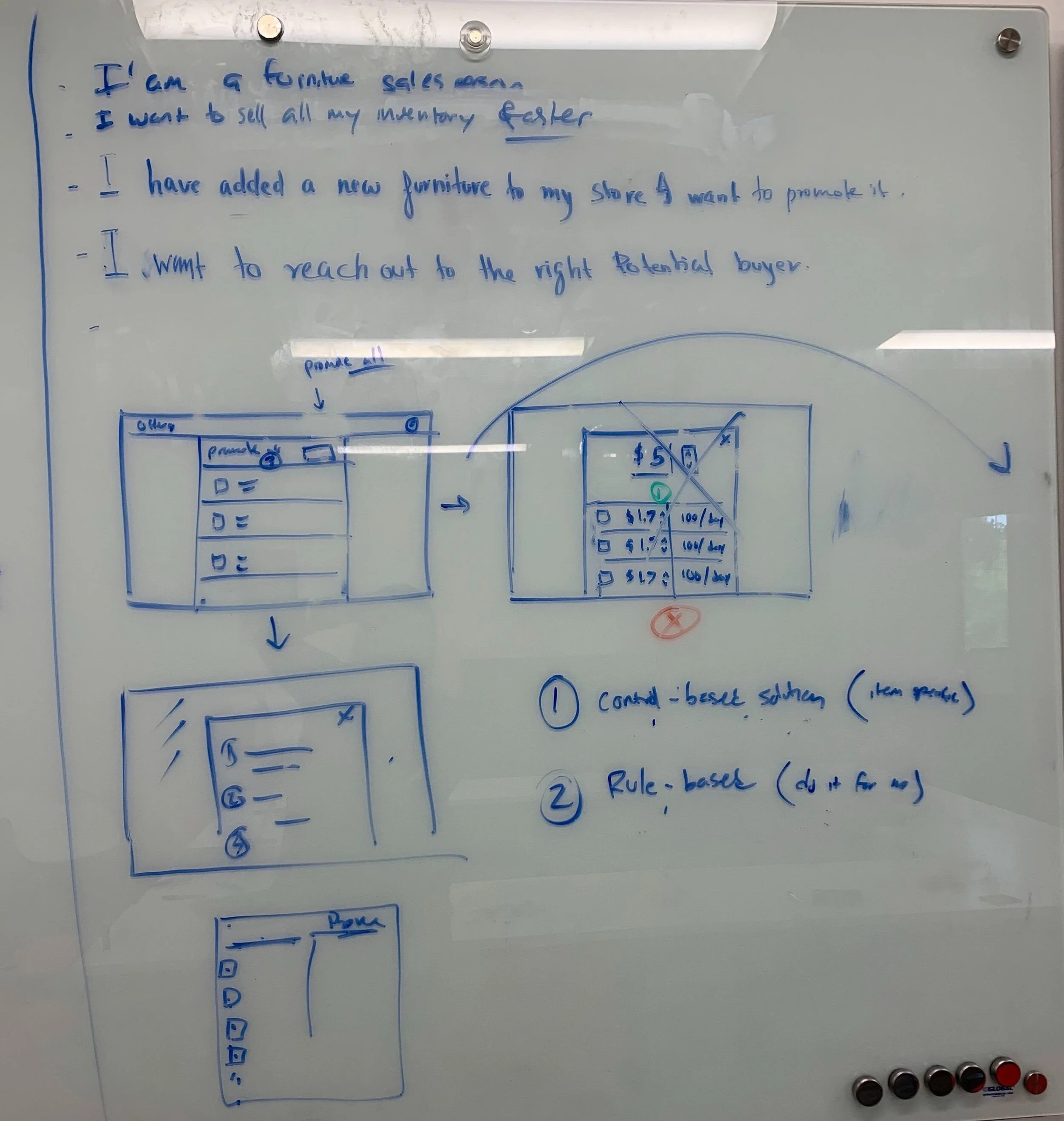
For bulk action: Providing sellers with ultimate control
Now select multiple items in one go to Sell Faster, Mark sold and Archive.
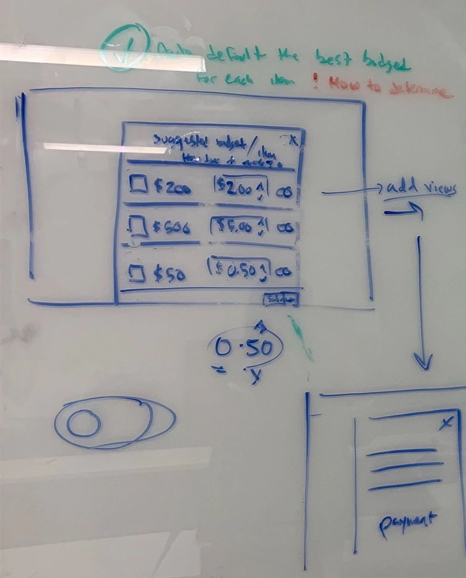
For Sell Faster feature: Budget advertising
“Advertise your item for as long as you want and for as low as $0.50 per day!”
“If your item sells in the middle of your campaign, only pay for the days that you use. You will not be billed for the remaining days!”
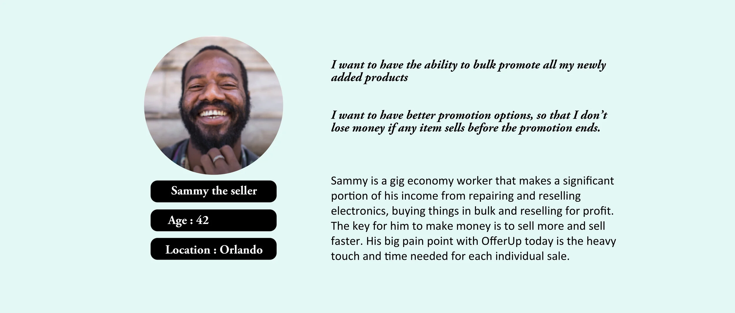
Persona
I worked with an existing persona “Sammy the seller”.
Redesigning
After analyzing all of the problems with the existing Sell faster feature layout, I worked with the product manager on the team to develop a concrete set of feature requirements to improve the user experience.
Bulk action requirement
Sellers should easily search the items on the listing page.
Sellers should identify the difference between multi-selection and individual selection of items.
Sellers can easily discover CTA Sell Faster, Mark sold and Archive.
Sellers should be able to differentiate between views and impressions.
Sell faster feature : Budget advertising
Sellers should easily understand the number of items they are promoting.
Sellers should bulk-promote multiple items in one-go
Seller should easily understand “the estimated number of views” to “money spend” ratio per item/day.
Sellers should be able to set the promotion duration.
Sellers should be informed that billing will stop as soon as they “mark sold” or “stop” the promotion.
Sellers should be able to see the billing methods and can change it.
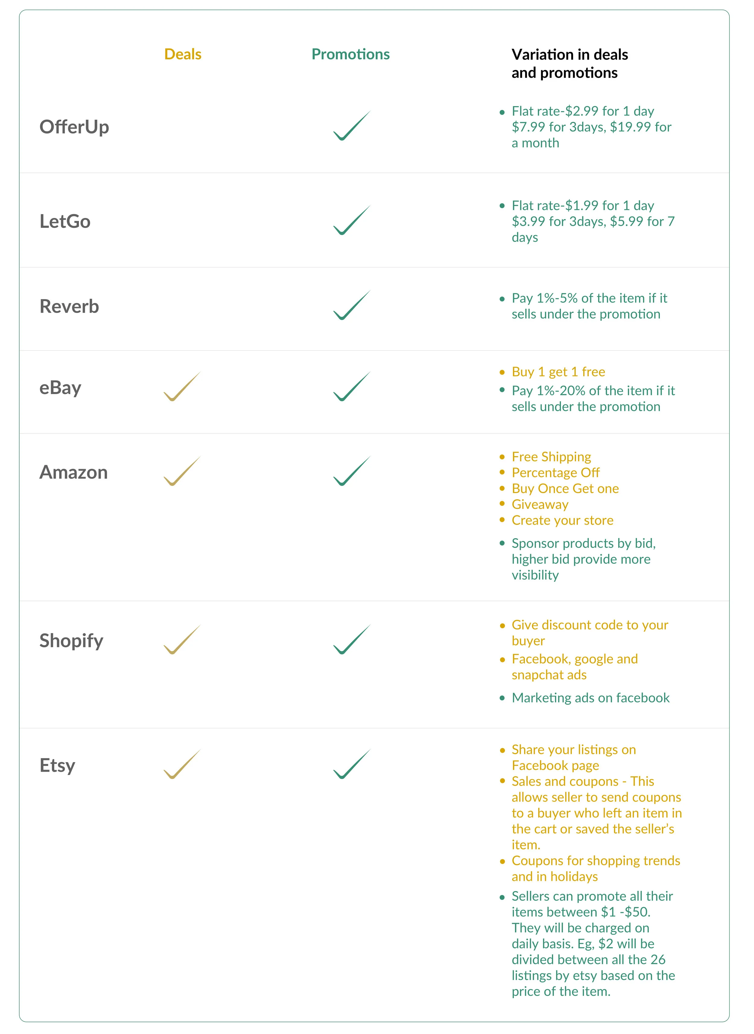
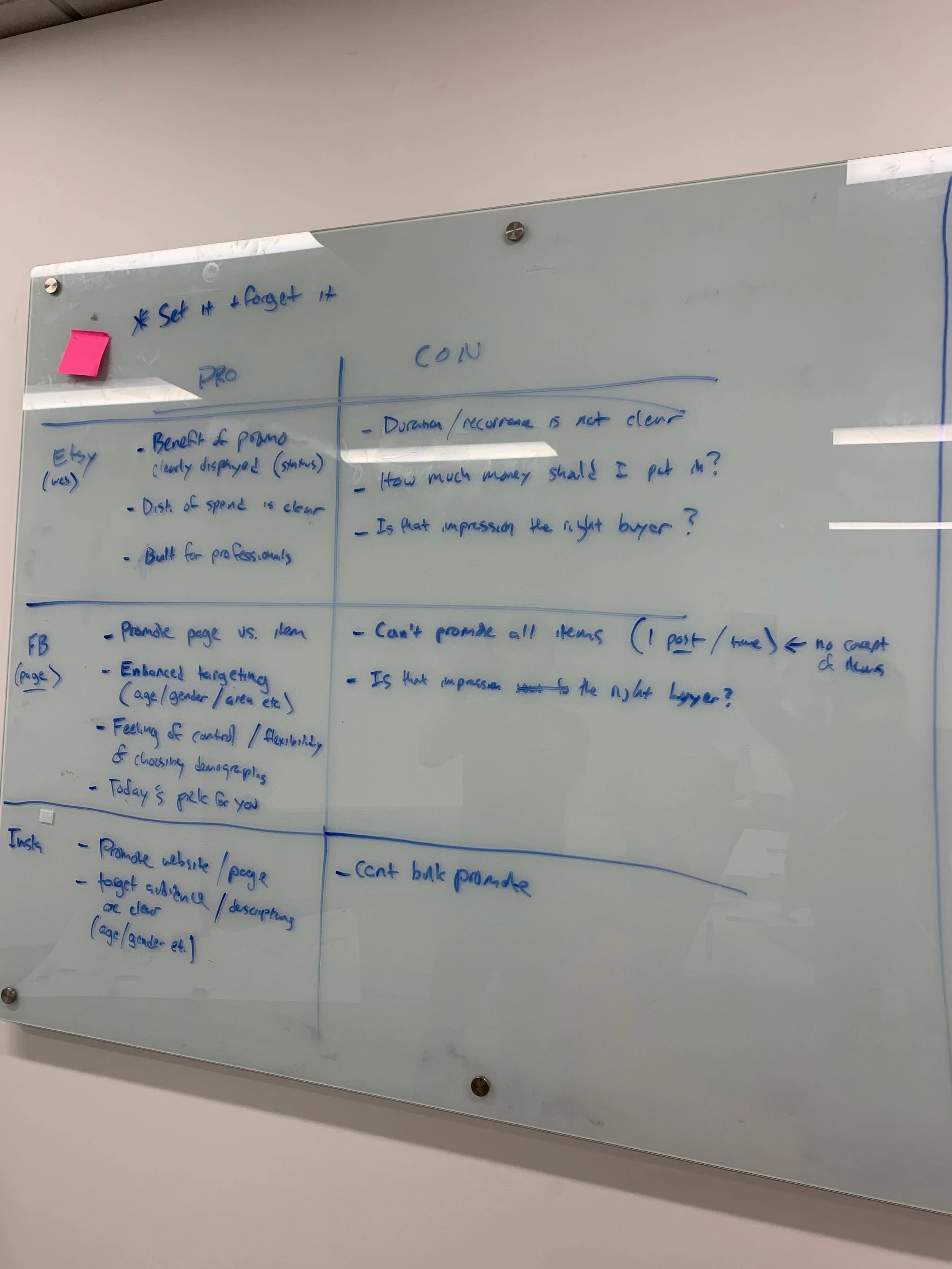
Competitive Analysis
From there, I performed competitive analysis to deep dive on promotions feature provided by other marketplaces. The marketplaces I researched were a mix of platforms geared towards individual seller (like LetGo and Reverb) as well as professional sellers (like eBay, Amazon, Shopify and Etsy).
Design
Brainstorming & Early Explorations
I did an ideation session to come-up with different ways to design the new proposed solution. I created multiple iterations of the listing page and Budget advertising feature to address these issues.
Wireframes and prototype
I designed the mockup for Bulk Action and Sell Faster features as shown in the interaction below.
Bulk action:
Added Sell Faster, Mark Sold and Archive CTA on top of the listings.
Added search on top of the page to give the ability to search any item from the listings.
Kept the existing Sell Faster and Mark Sold option on individual item to give the ability to promote a single item in one click.
Added a separate column for Impressions and Views so that users can differentiate between them.
Sell faster model:
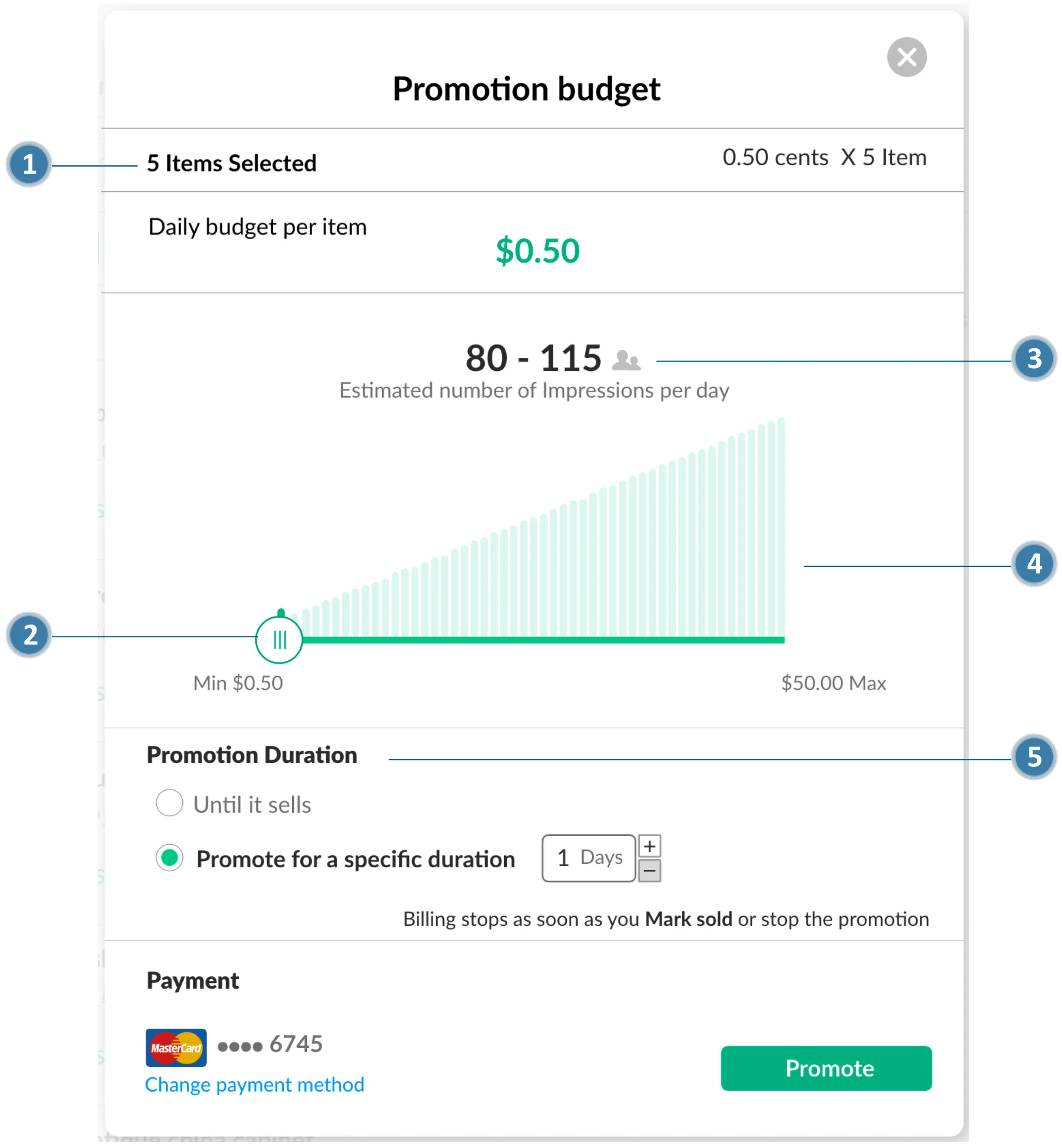
Display number of items users selected for promotion.
Designed a slider to adjust budget for impressions model.
Display the estimated number of impressions per day based on user’s budget.
Added visualization to show that number of impressions would increase with increase in budget.
Added abilities to promote Until it sells or Promote for a specific duration
Usability Testing & Iterations
Usability testing - 1 round
I conducted usability testing with 5 participants with an aim to test solution concept, clarity of components, and user efficiency. You can view the test guide here.
Findings
I received following feedback from the participants including concerns about some edge case scenarios.
For Bulk action:
All the 5 participants understood that they need to select multiple items to promote their products.
For Sell Faster:
Users understood the impressions model but they wanted to see the total budget for all the items they selected for the promotion.
None of the users chose Until it sold option, they chose Promote for a specific duration.
Final Mock-up
Based on user feedback, I made the following iterations in the design.
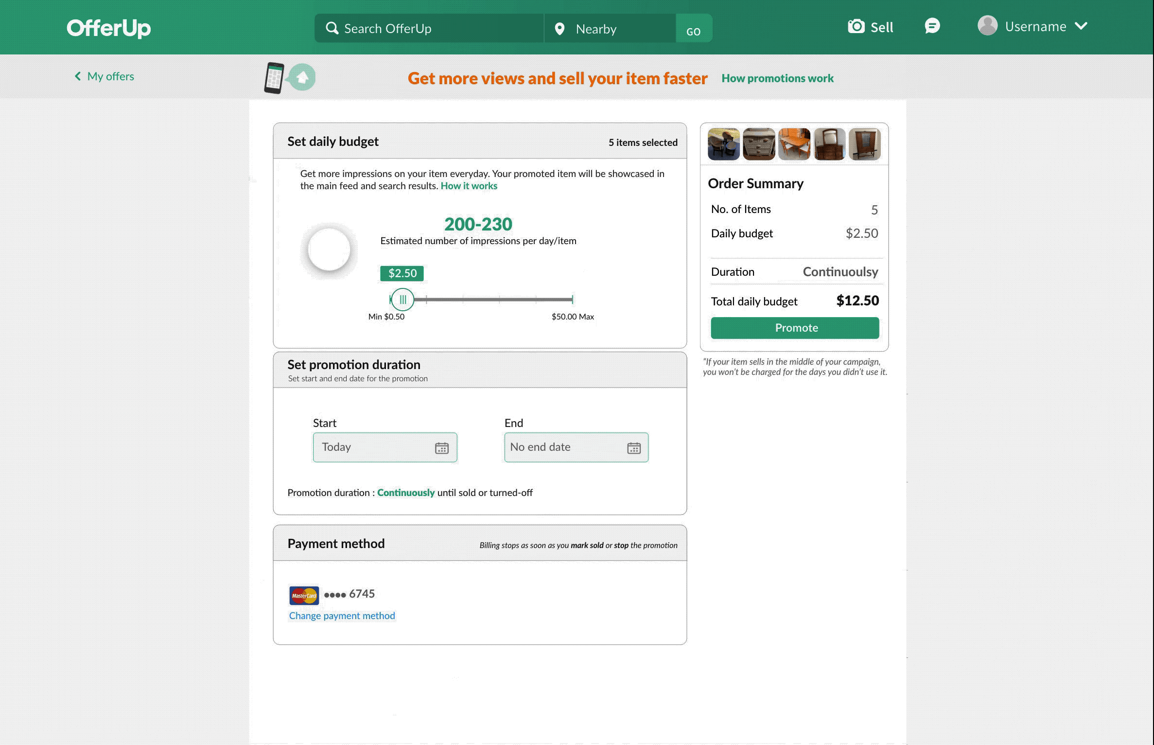
Changed the layout for Sell Faster page to accommodate order summary with pictures of all the items selected for promotion which provided a better overview of user actions.
Added 1 day budget and total budget to order summary view to inform users about total expenditure on promotion.
Added calendar to provide promotion duration which provided better and fine grained control to the user.
Final Round Findings
I conducted 2 more rounds of user testing with 5 participants in each round with a focus on following questions.
Is it easy for the user to understand how many items they have selected to promote?
Yes, all 5 participants understood that they had multiple items for promotion, and they were able to see the images on the top right corner of the page.
What is their understanding of promotion duration calendar?
All 5 participants were able to select the start and end date on the calendar. Changing the date confirmed the status by showing ”promoting continuously” or “number of days”.
Is the order summary easy to understand?
Yes, adding an order summary made it clear for the user to understand the entire calculation for impressions and how they are being charged.
Feedback from User Testing
I conducted 2 rounds of user testing with 10 OfferUp users, who had sold at-least 2 products in the past on the OfferUp platform.
User testing clip
Next Steps
The concept of showing range of impressions by adjusting daily budget proved to be successful during user testing. Currently, the range shown in the mockups above is for representation only. As a next step, team would work on getting correct data to represent actual range of impressions based on the budget.
There were multiple learning from phase 1 which heavily influenced the design for phase 2, which is under NDA.
What I Learned
◼︎Multi Faceted Growth: 🤹 I was fortunate to work on one of the next big projects at OfferUp. I attended brainstorming sessions and contributed by giving feedback on the proposed solutions. It was a huge learning opportunity for me where I got to see the business side, the technical side and the designer side, all at the same time.
◼︎Communication Skills: 🙋I regularly communicated the design decision with my manager which ensured that I get feedback at each decision point. I found it best to whiteboard my initial thought process and then refine them through discussions before creating final design artifacts. Proper communication surfaced missing interactions early in the process and avoided major changes and delays at a later stage. I justified my design decisions to the program manager so that he can communicate effectively with the stakeholders. In meetings with the entire team, where I had to showcase the blueprint of the design, I preferred to walk through the prototypes while highlighting important details in each section. I have learned that collaboration is an art which requires patience and understanding of varying mindsets in the group.
◼︎Data Driven Decision: 🔍 I learned not to use assumptions and rather use data to take a decision. I used data from user testing and research to backup my decisions during design review meetings. This helped immensely to get stakeholder buy-in on the designs.
◼︎Deep Dive: 🏊 In order to come up with design for the feature, I deep dived on each marketplace offering to understand how they are approaching the solution. This helped us come up with a solution which was on par with the industry standards and yet customized for our user base.
Other Projects

Smartsheet- UX Designer
Influencers - UX Researcher

Autonomous Cabs- UX Designer

Pratt Fine Arts - Visual Designer

Pickup order - VUI Design