Team
Norah - UX Researcher
John - UX Designer
Duration
3 weeks
Recreation.gov
Recreation.gov is a one-stop website for planning trips and making reservations to federal parks. As part of a group project, our team was tasked to redesign recreative.gov application.
The iOS mobile app helps outdoor enthusiast find campsites, but the app does not meet outdoors enthusiasts' needs. There is little to no awareness of the app, finding information is difficult, and for all reservations users are redirected to the website from the app.

Background
With this given information, our team set out to design a native application for Recreation.gov that would contain features and functions that would aid in seamless discovery, provide detailed and relevant information, and reservations features within the app. With all of these available within the mobile application, we hope that the app would be the true one-stop shop for outdoors enthusiasts
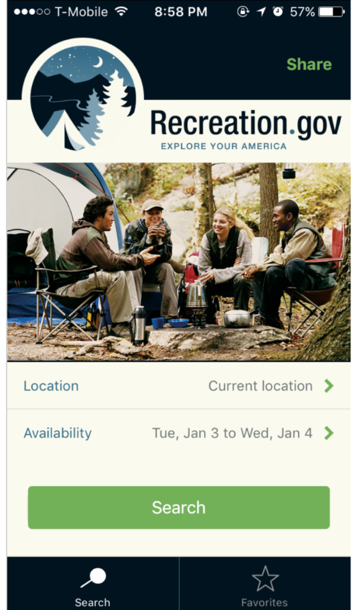
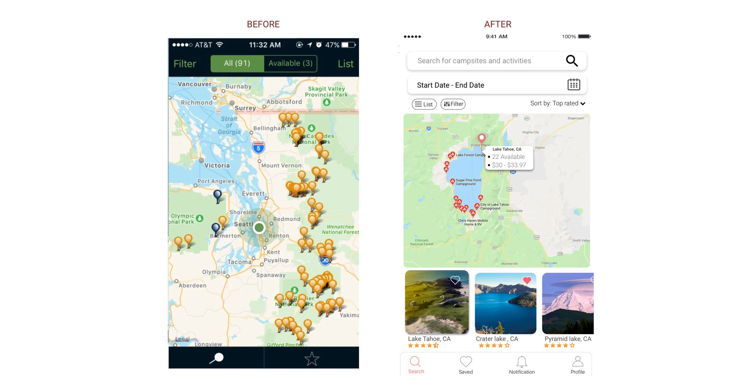
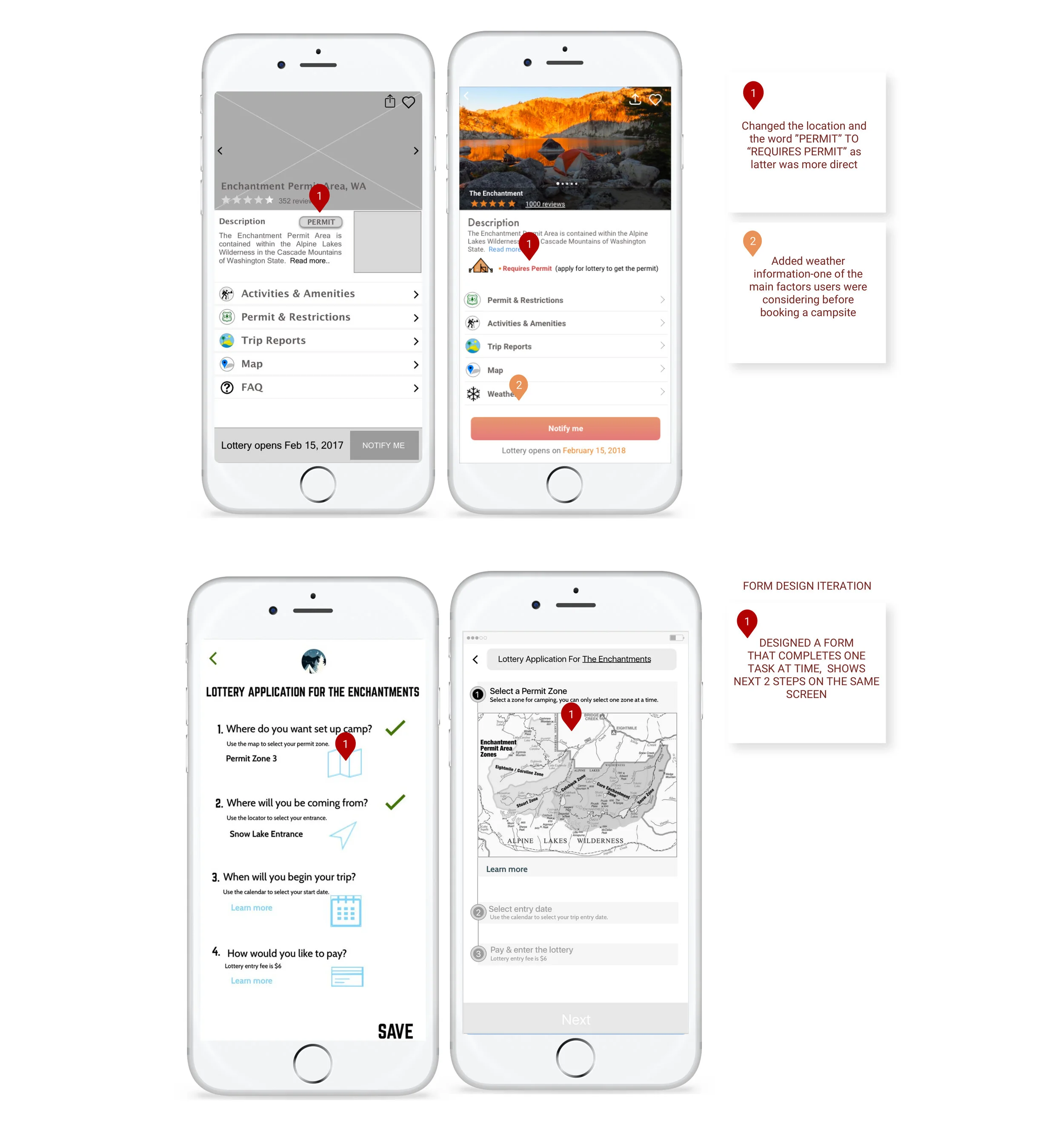
Current app: Two search button on the home page is confusing
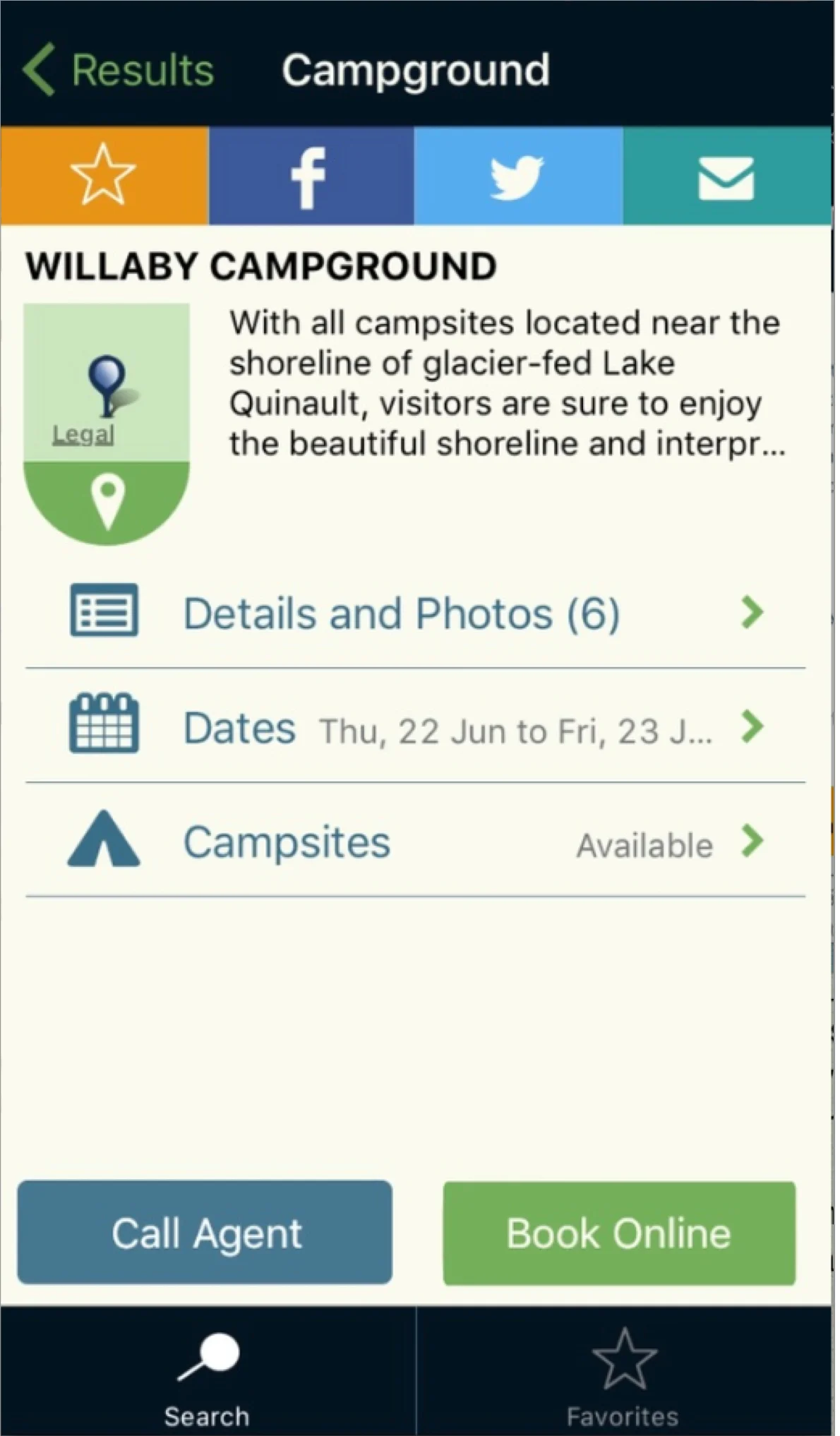
Book Online button redirects to website or phone call to make reservations
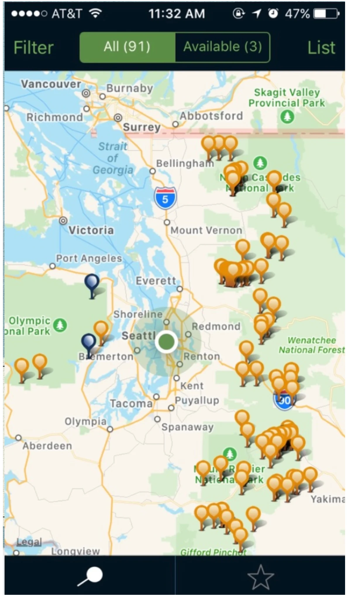
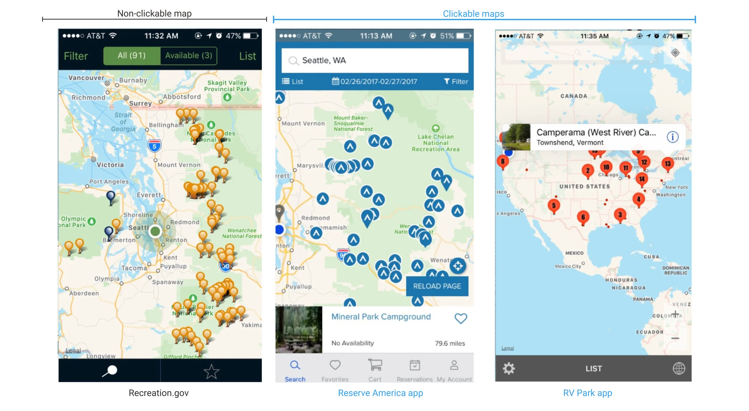
The pins in this view are not clickable
Design Challenge
How might we design a mobile app that is one-stop shop for outdoor enthusiast?
Research
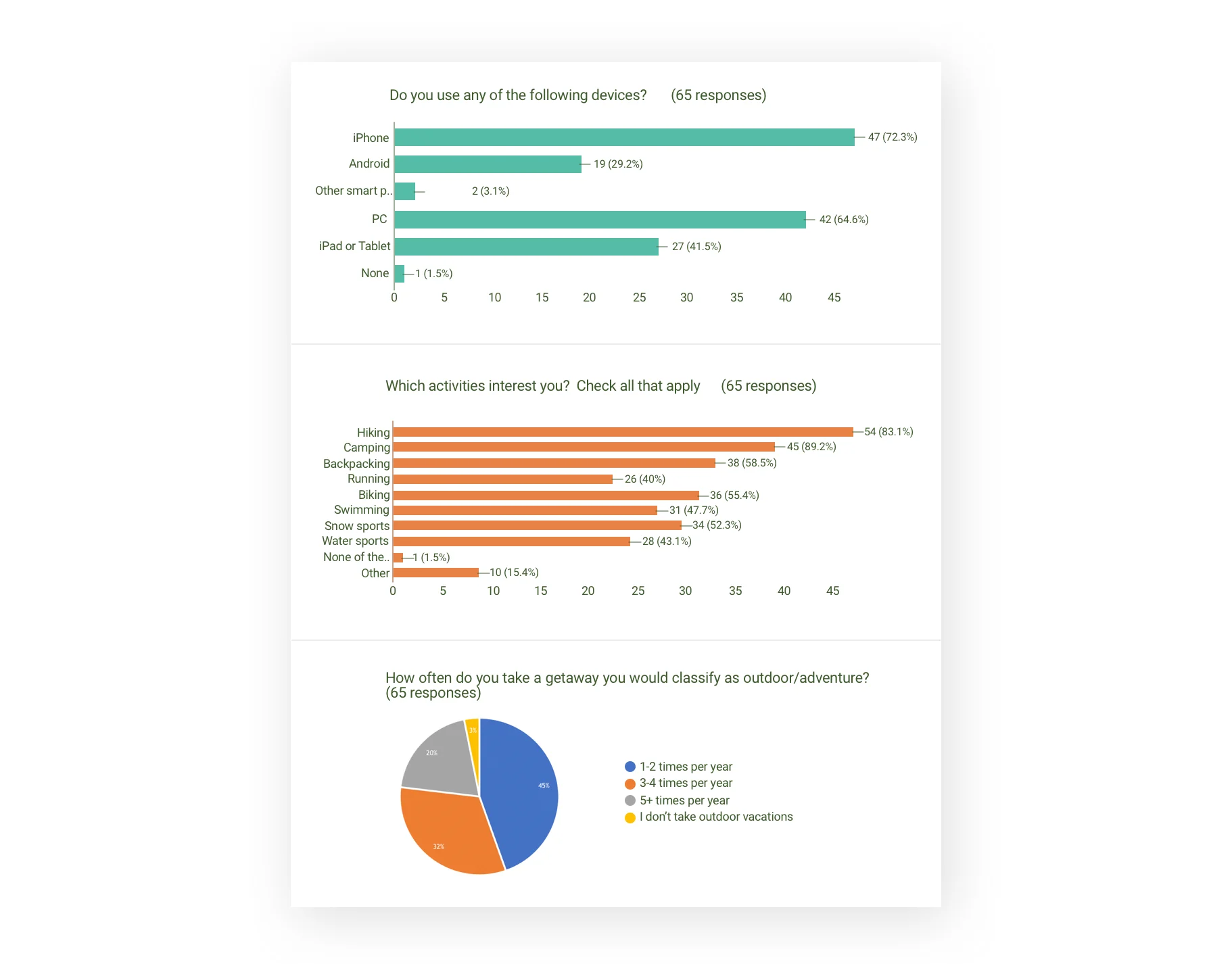
Screener Survey
In order to pick users for our research, we designed a screener survey that was meant to identify outdoors enthusiasts. From this survey, we received responses from 65 avid outdoors enthusiasts.
We found that a majority of outdoor enthusiasts who took our screener owned iPhones. This gave us confidence to continue down the pathway for designing an iOS mobile application.
We shortlisted 10 enthusiast who met our criteria of enjoying the most popular activities and those going on outdoors excursion over three times a year.
We divided our research into two parts:
Users’ perspective on current app
User interview to learn about their expectations from an improved app
Users’ Perspective on Current App
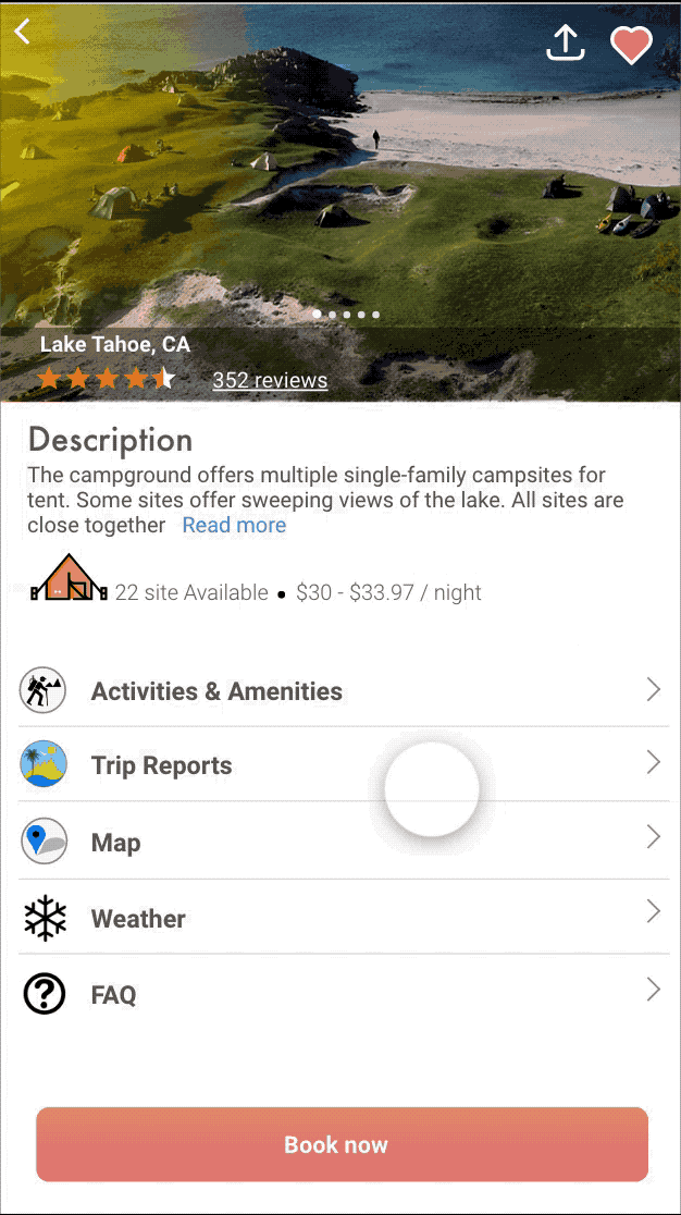
We had our participants walk through the booking process within the app, asking for their feedback on their experience along the way. They pointed out that the description page for a campground did not provide relevant information which would help them decide whether they would like to take a trip or not. For example, the campground page should provide weather information, trip reports and activities. All the users concluded that:
Why would I come to the app if I am not able to book the campground within the app? I would rather go to the website directly.
User Interview
With the large amount of data from our ten interviews, I began to create affinity diagrams with my teammates to see where common themes and pain points arose. If a word/theme was mentioned by at least half of the interviewees we considered it significant. This session helped us in categorizing and prioritizing the data of the problem, issue and challenges faced by the outdoor enthusiast.
From the interview, we figured out that there is a lottery process for booking some of the campsites. This process is used for highly visited campsites but the process was lengthy and confusing which deterred users from going through it.
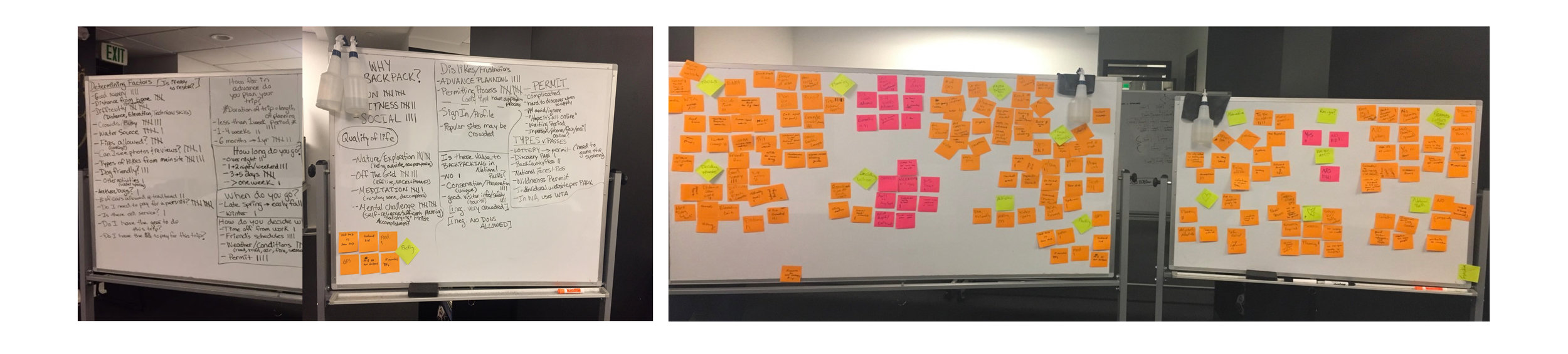
Affinity Diagram
Research Insight
Three major insights we received during our research were:
Persona Development
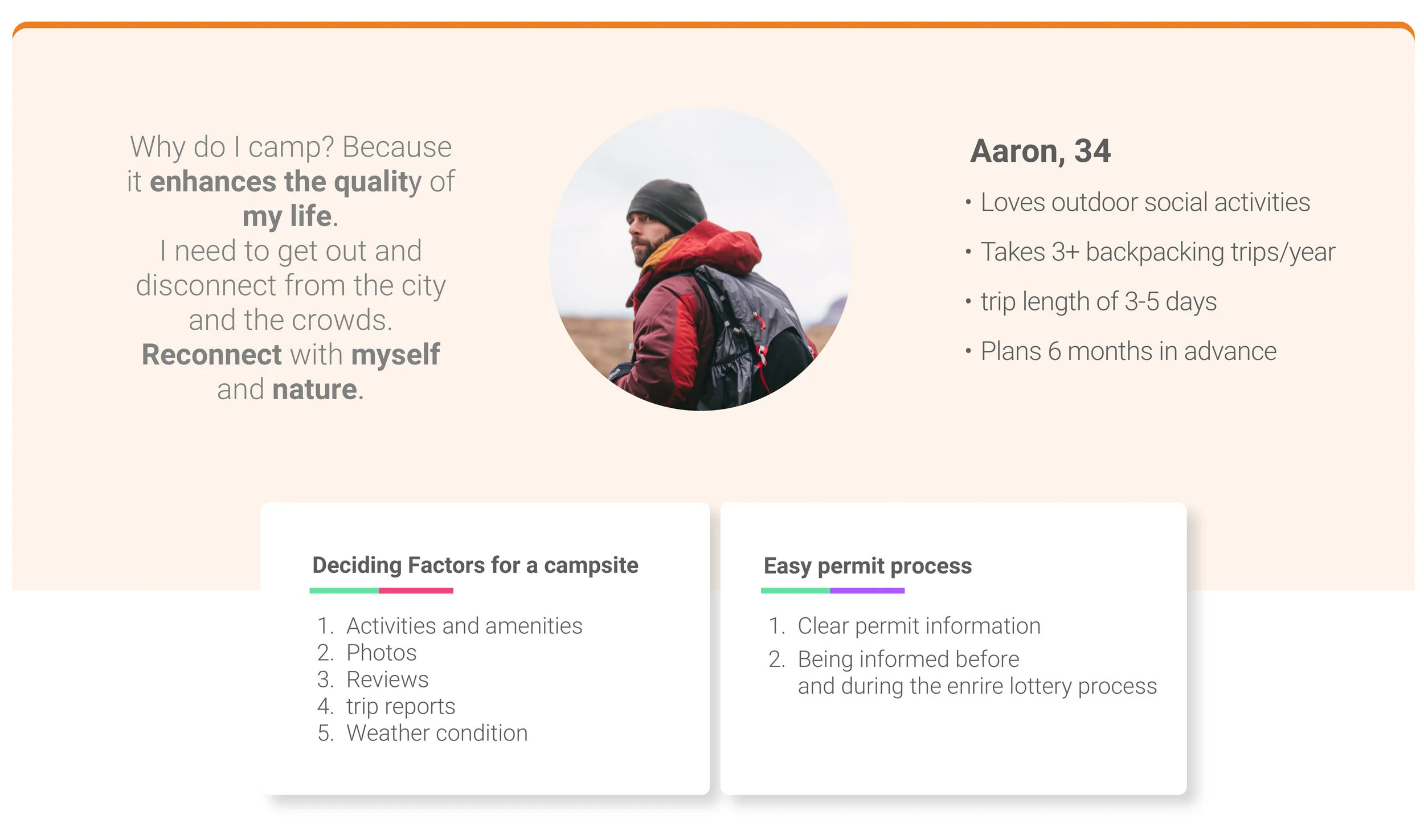
We created a primary persona named Aaron that would help us work towards our design solution and focus on our key goals in our design.
Competitive Analysis
I performed competitive analysis of the key features and functions on different apps and websites that have similar features as Recreation.gov.
The following features stood out in the apps that I analyzed:
Clickable maps (Reserve America, RV app)
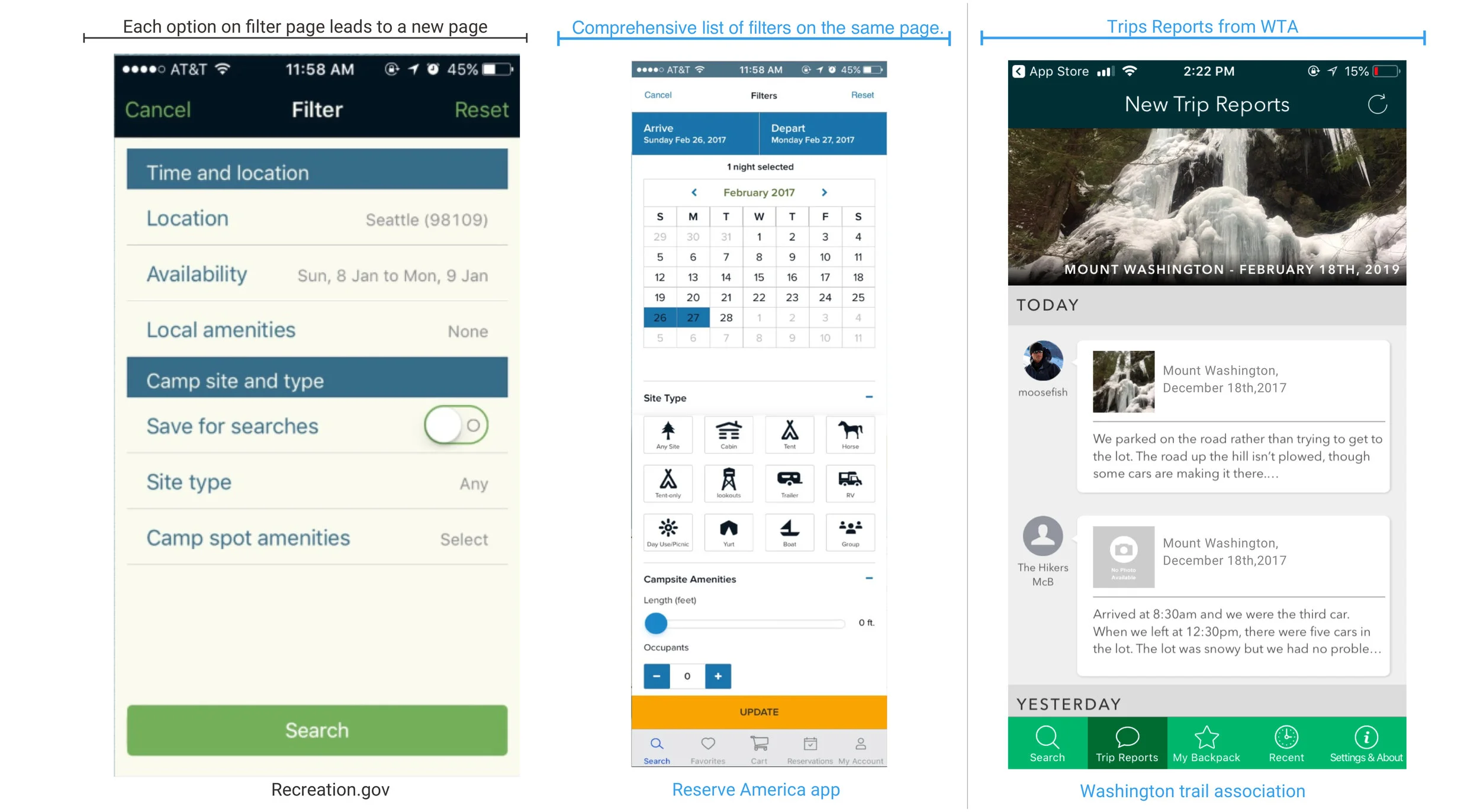
Helpful Filters(Reserve America) and Trip reports (Washington Trail Association)
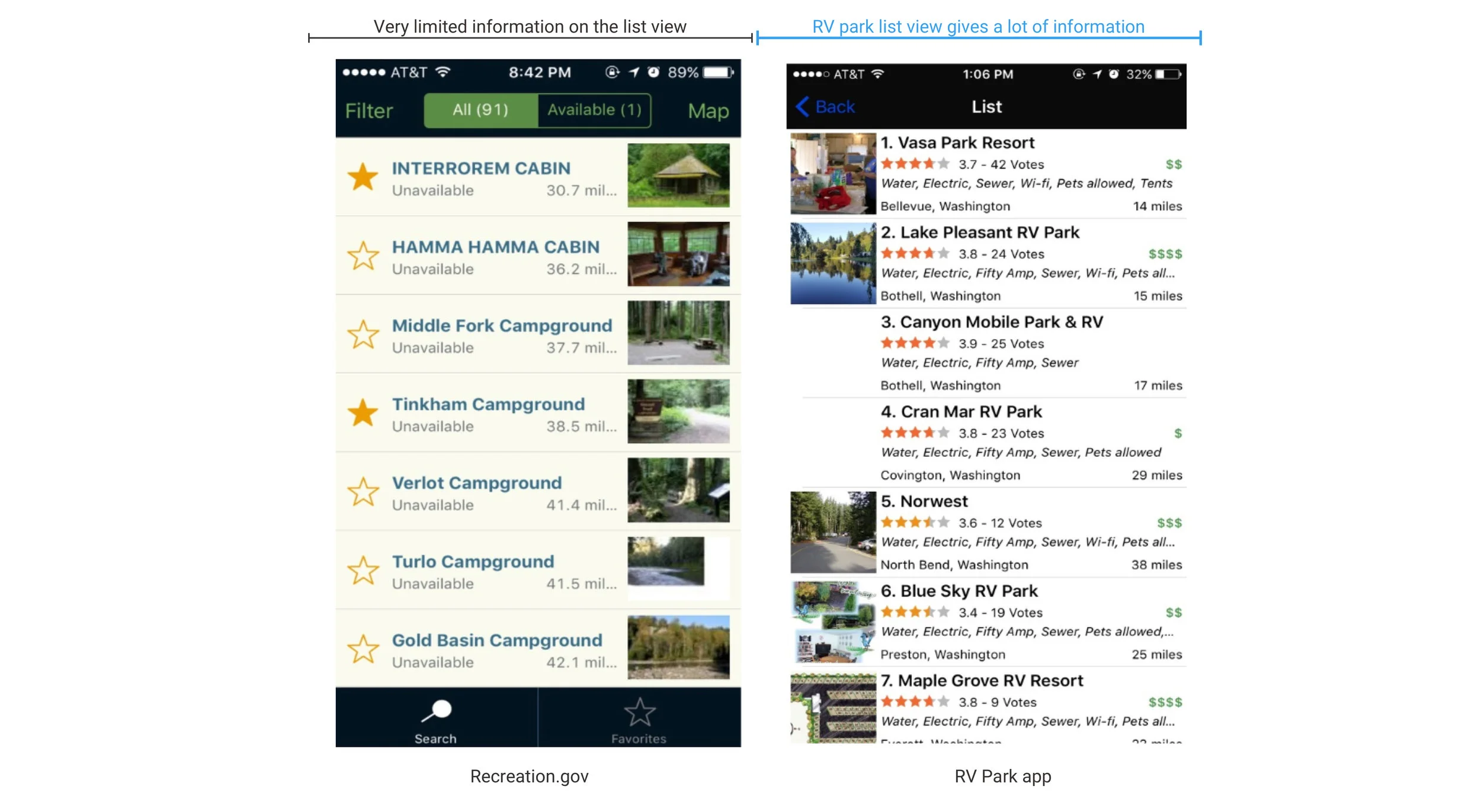
Detailed information in the list view on RV park app
Design
Journey Mapping for Permit Process
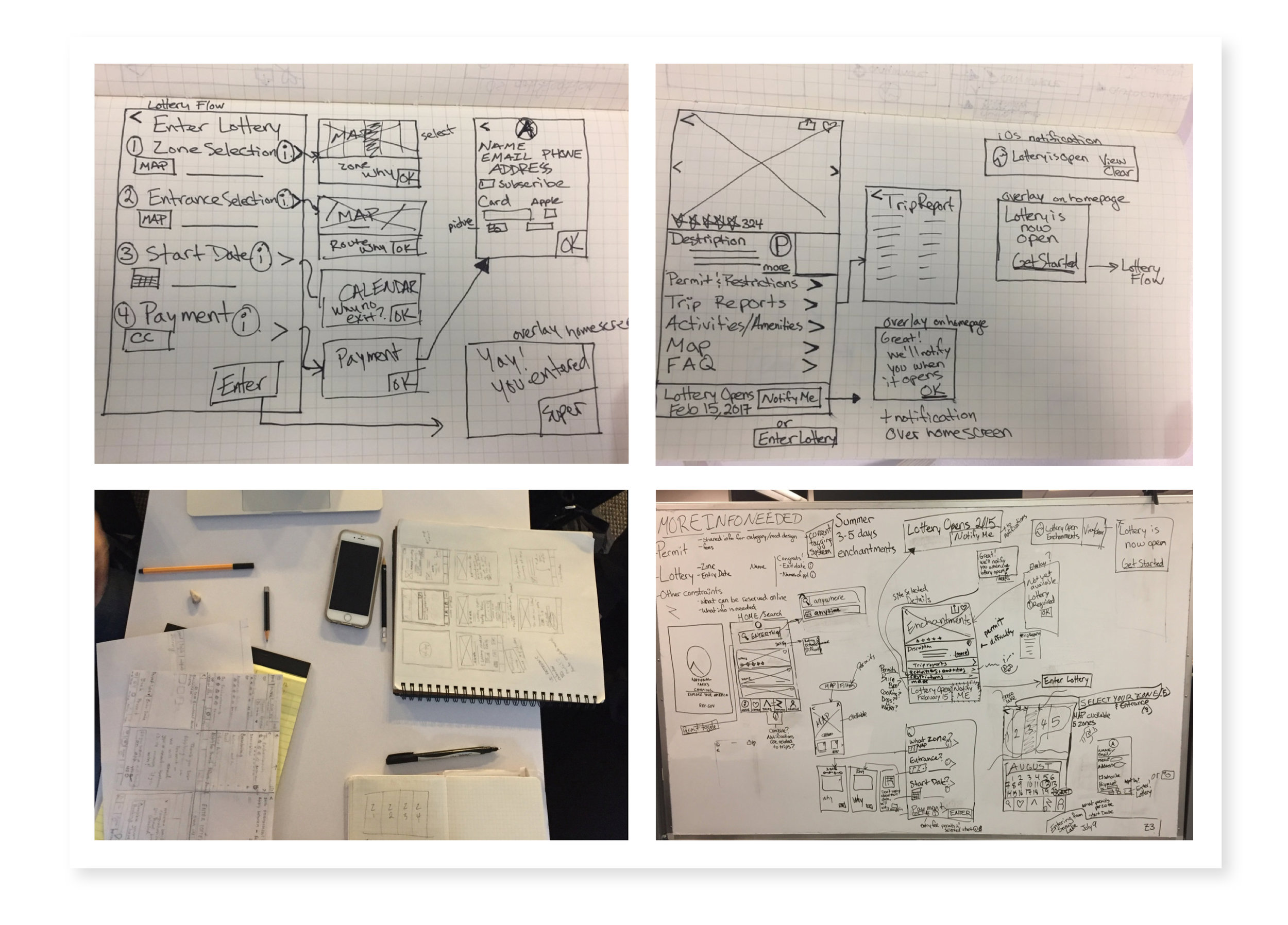
Identifying use cases required in the app for lottery process
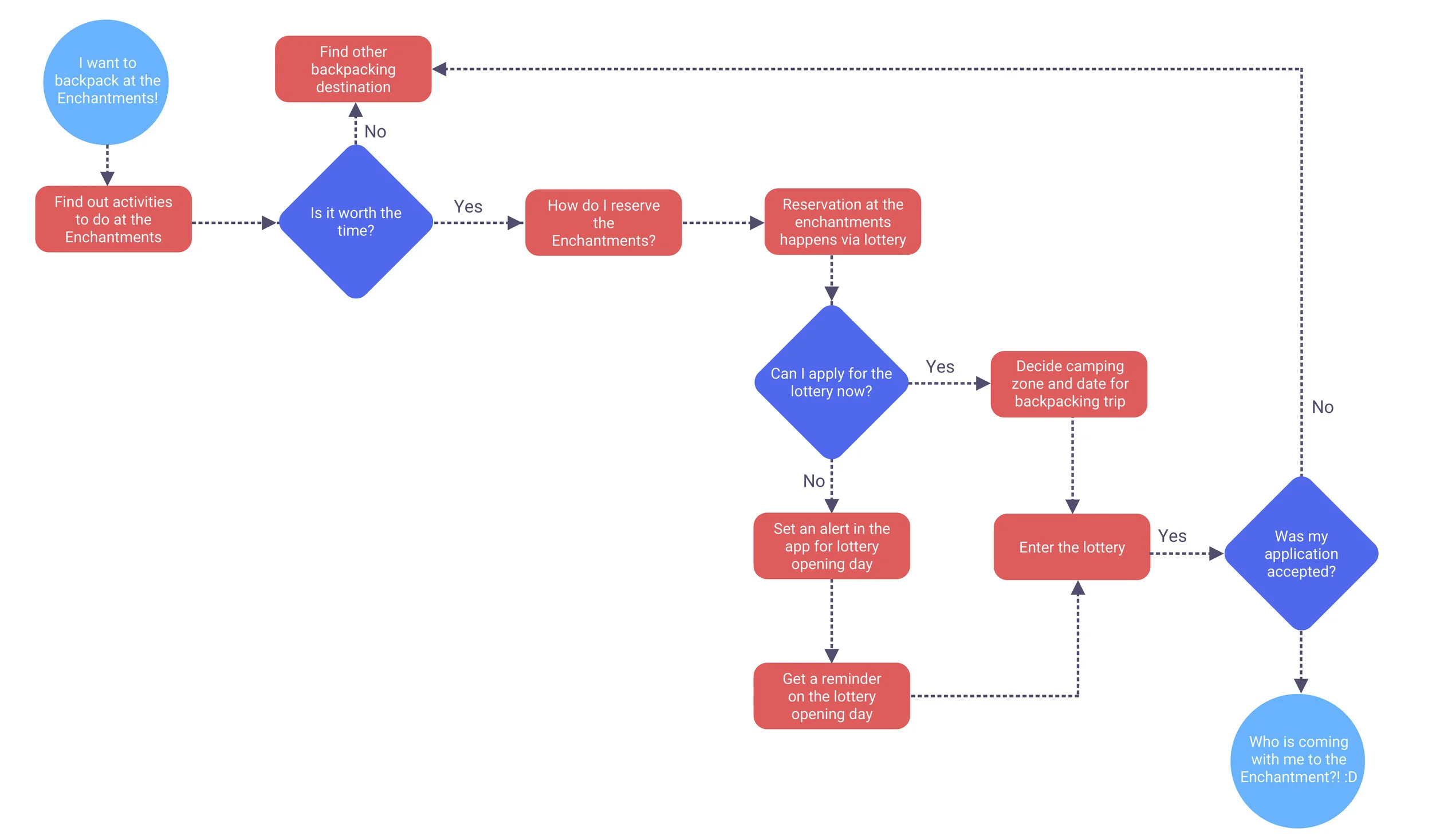
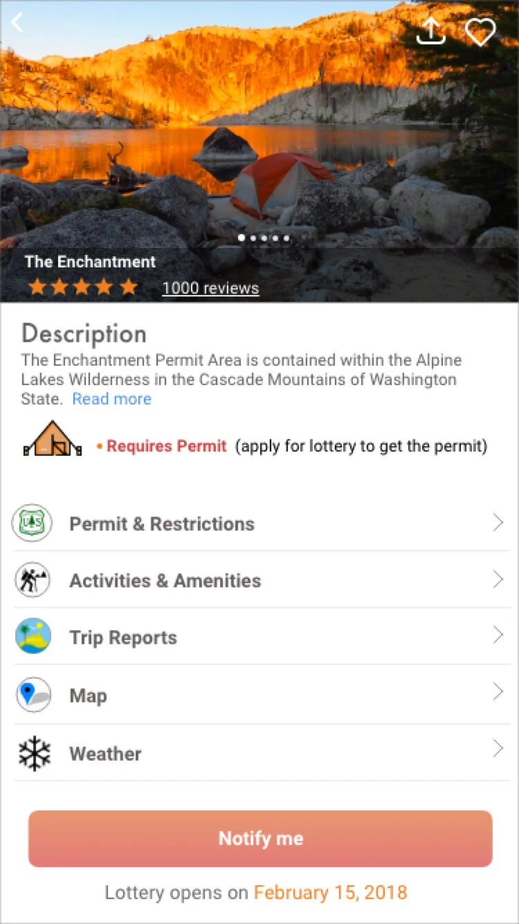
We created a user flow for our persona “Aaron” to help us visualize the design and development of the entire lottery process. We chose “The Enchantments” camping site as an example to ease the lottery process for a campsite as this location was mentioned during the interview several times.
Brainstorming
We started brainstorming our initial ideas and designs on paper and identified strong points from each design which we then incorporated into an interactive paper prototype.
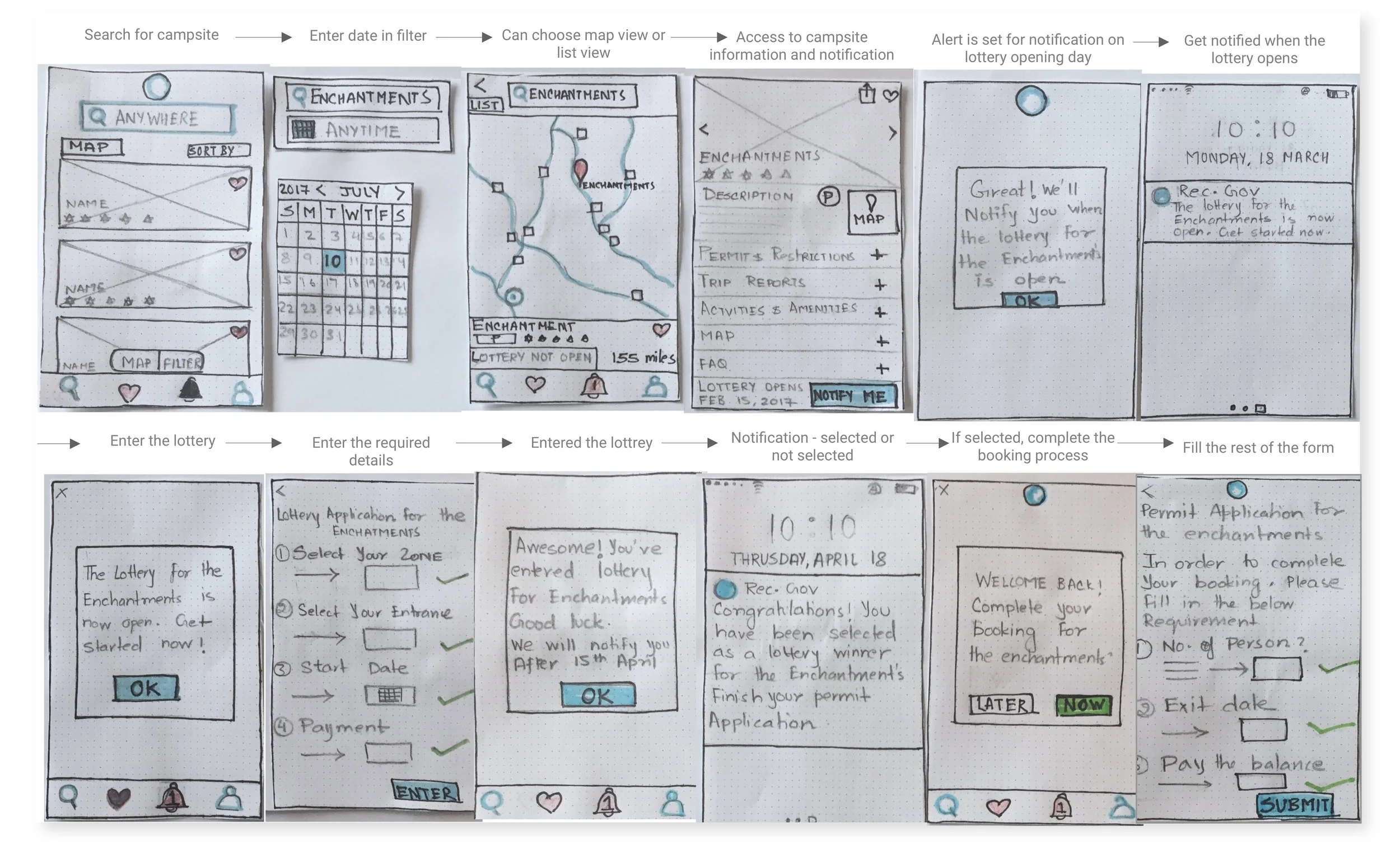
Interactive Prototype
For the first round, we conducted guerrilla testing with 5 users and iterated on our design for the low fidelity prototype. Our participants gave us great feedback related to application visibility, recognition, and user efficiency.
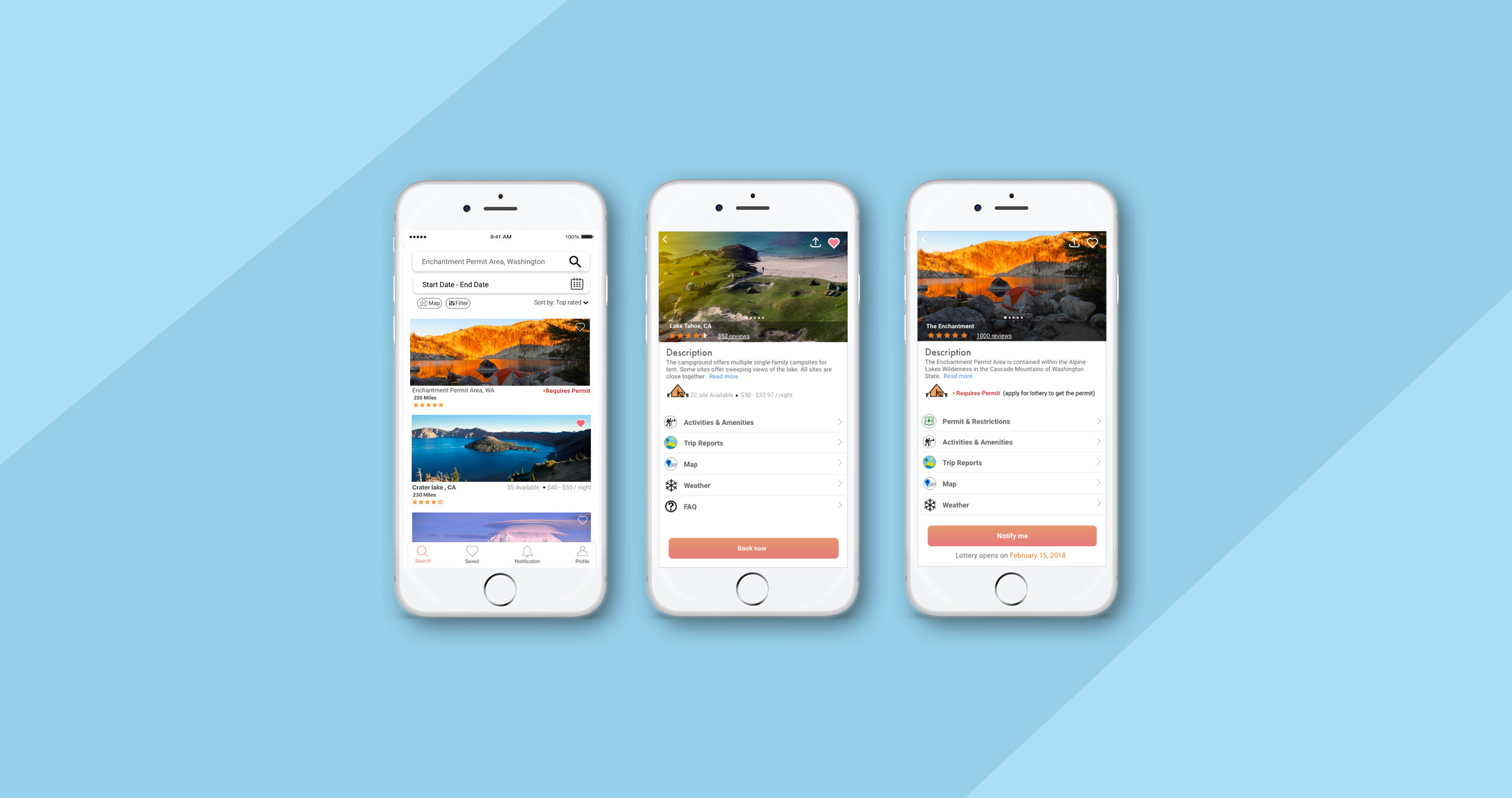
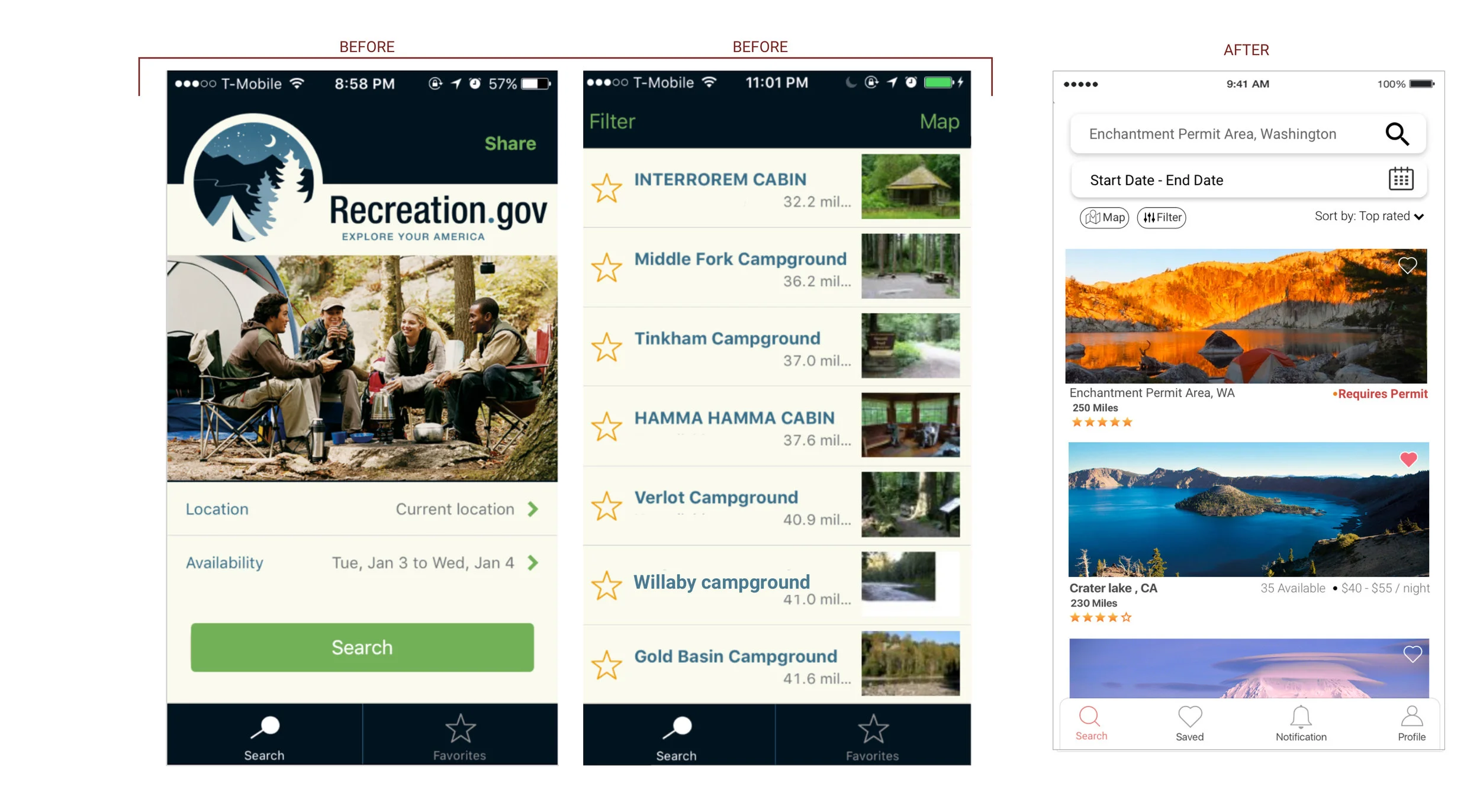
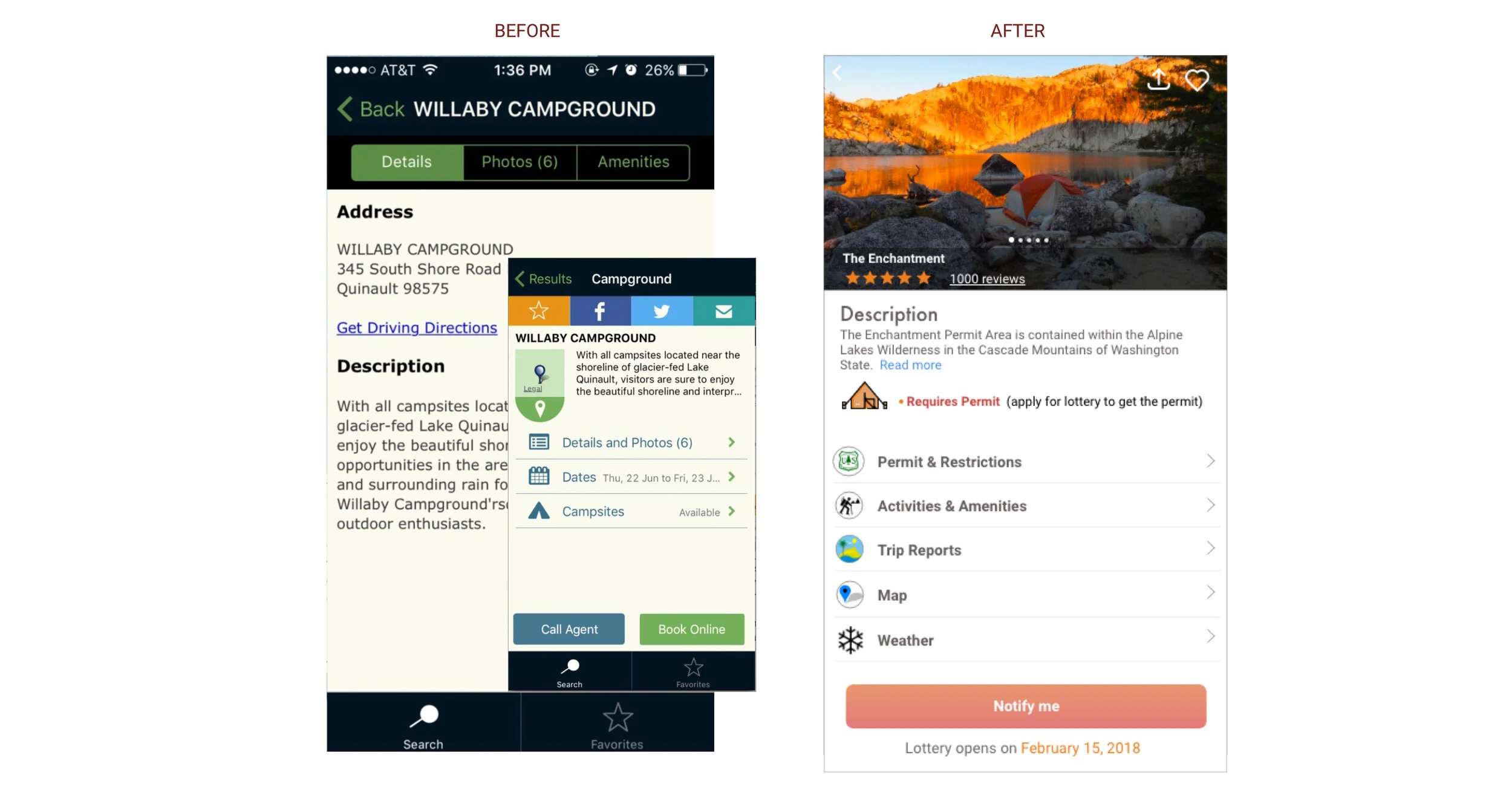
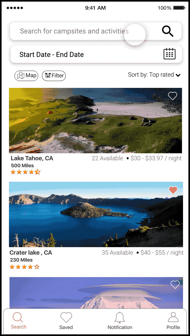
Before & After : Search Page, Destination Page & Map
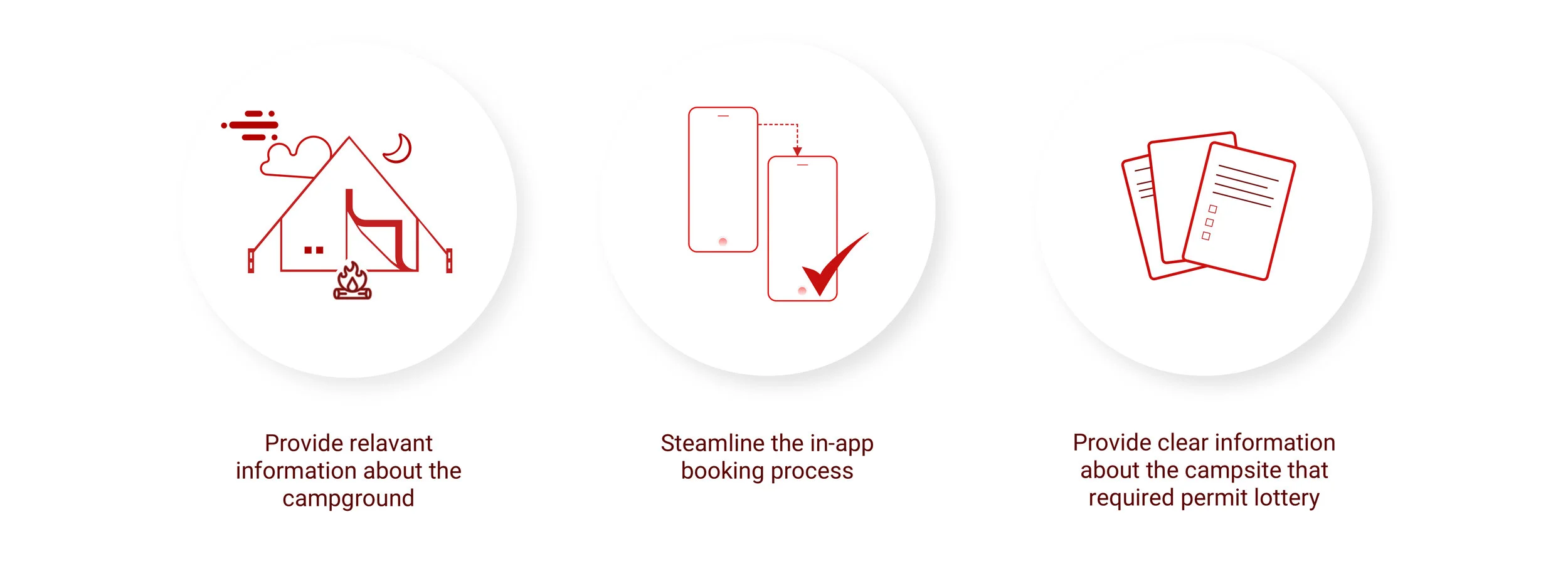
Final Design for:
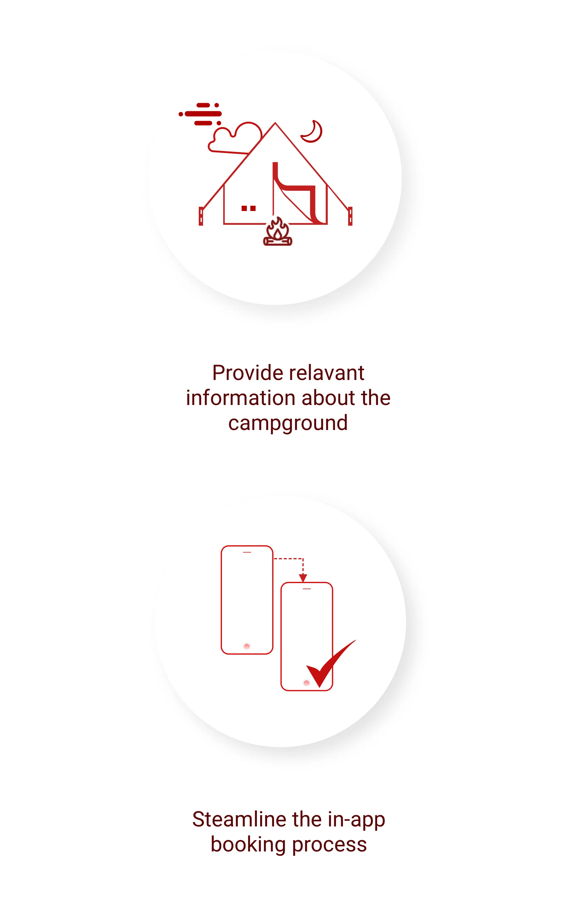
Finding campground information and streamlining the in-app booking process
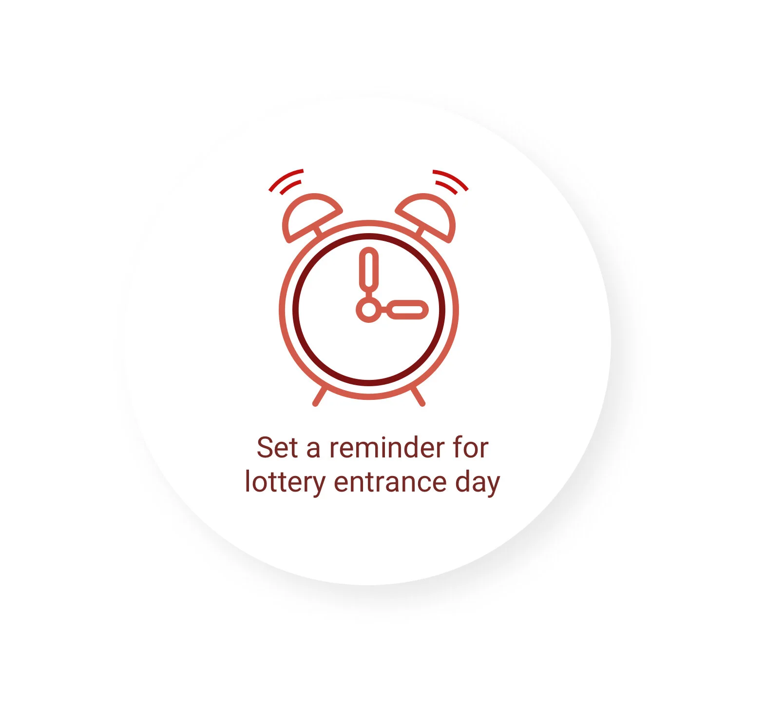
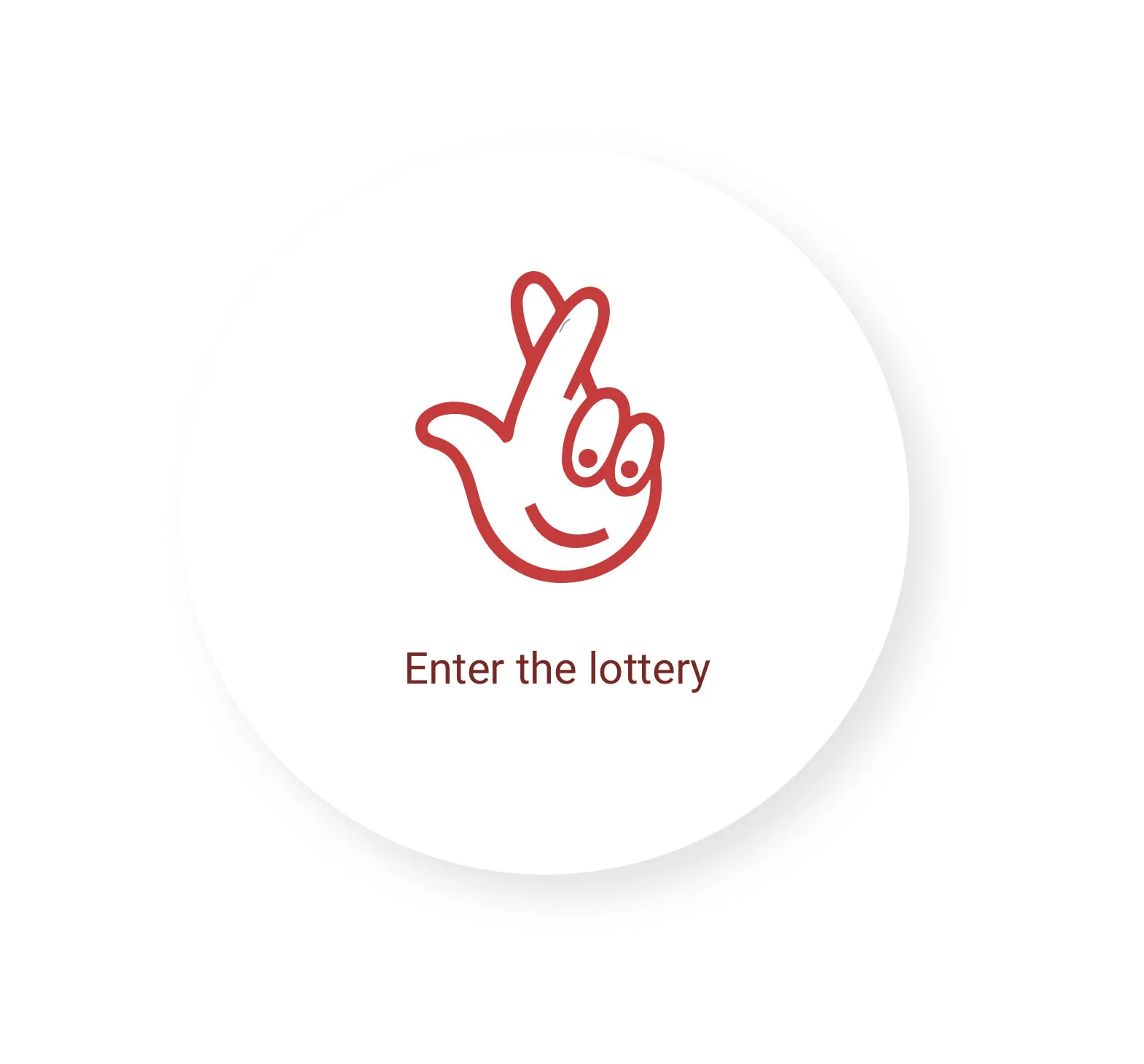
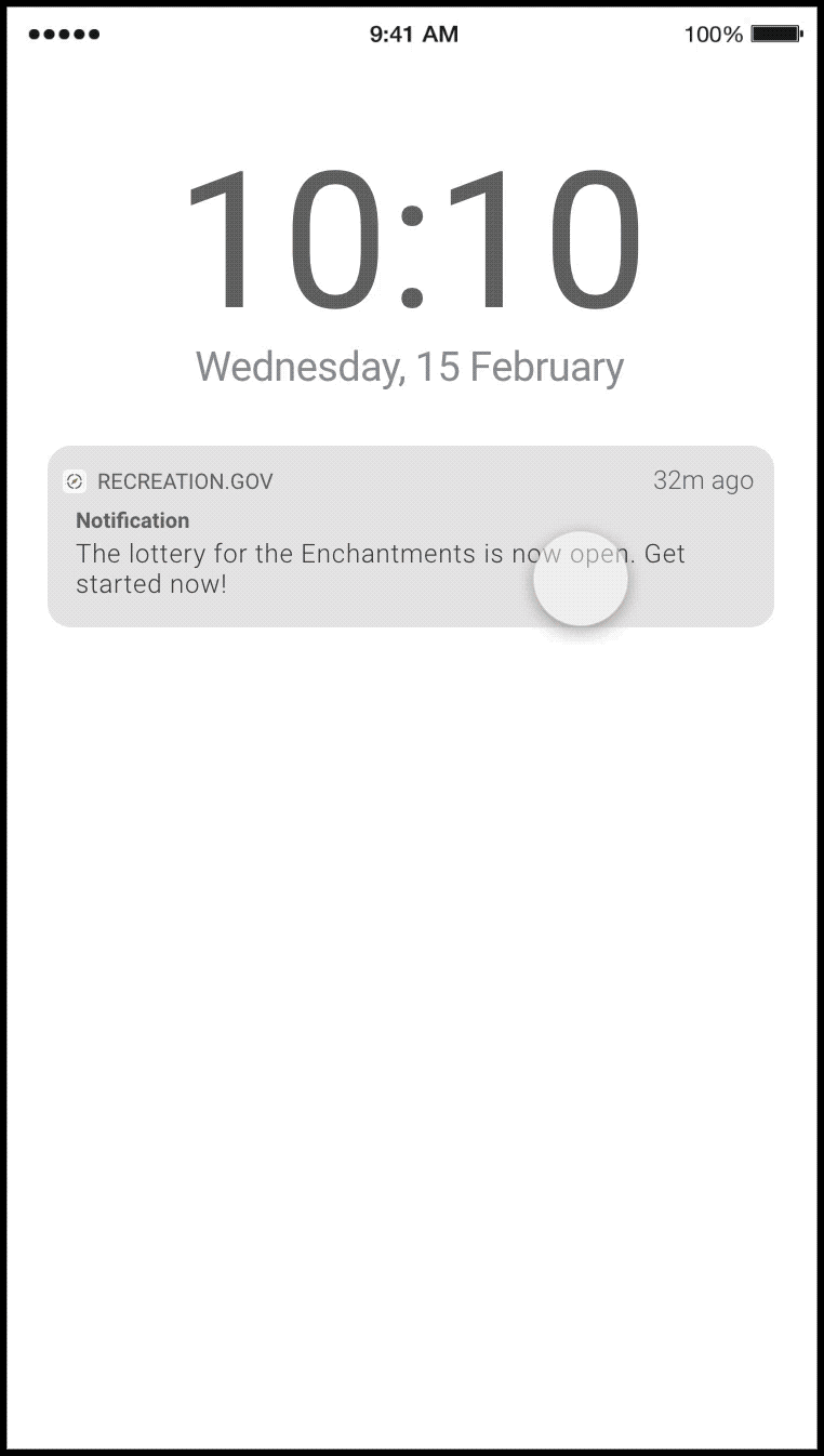
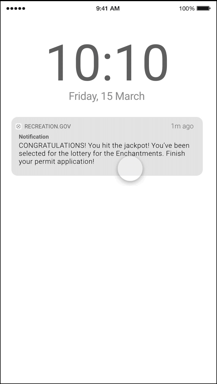
How does the lottery process work?
Iterations
Reflection
1. There are several other campsites that require the user to go through a lottery process for booking. I would like to include such campsites in the user research. There are slight variations in the process for each campsite and it would be challenging to include them seamlessly in the same lottery booking experience.
2. The information displayed on the campsite page is provided and maintained by officials at campgrounds. I would like to include them as well in my user research to understand their viewpoint for providing relevant information about a campground. Some of the information are seasonal or notifications like fire or flood hazard, closing of road due to an accident etc. These are very important information and I would like to include them in my design.
3. I would also like to provide an integrated experience to officials at campgrounds to provide relevant information. I believe a service platform always performs great when concerns for all stakeholders are taken into consideration.